TL;DR: Creating a Website for a Business with StoryBrand
Start creating a website for a business by defining your audience, goals, and core message.
Choose a memorable domain and user-friendly platform to simplify creating a website for a business.
Use StoryBrand to structure content that makes your customer the hero and drives conversions.
Ensure legal compliance and accessibility while creating a website for a business to build trust.
Optimize for SEO and mobile usability to boost visibility and success when creating a website for a business.
Building your business website is like setting off on a thrilling adventure. It can seem overwhelming, but with the right map in hand, you’re destined to succeed.
Here’s your ultimate guide to creating a website for a business using Donald Miller’s StoryBrand framework—helping you tell a clear, compelling story that makes your customer the hero.
Why Creating a Website for a Business Matters
Imagine a sturdy base camp—your website serves as the foundation for your online presence. It’s where potential customers discover who you are, what you offer, and how you’ll improve their lives.
Without a professional website, you’re practically invisible in today’s digital wilderness.
Benefits of Creating a Professional Business Website
- Builds credibility and trust with customers
- Showcases your products and services clearly
- Generates more leads and increases sales
- Enhances customer support and engagement
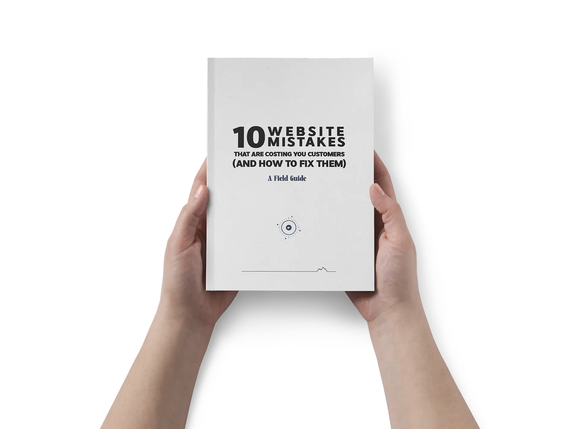
Get our Free Guide – 15 Marketing Mistakes & How to fix them.
Download our free eBook that uncovers 15 common marketing mistakes and how to avoid them.

How StoryBrand Simplifies Creating a Website for Your Business

StoryBrand clarifies your message by placing your customer as the hero and your business as the guide.
It ensures your website clearly communicates what you offer, how it helps your customers, and how they can get it—passing the “grunt test” instantly.
Step 1: Clarify Your Purpose Before Creating a Website for a Business
Define Your Target Customer Clearly (StoryBrand’s Hero)
Picture your ideal customer—what struggles do they face, and how can you help? For instance, if you run a landscaping business, your customer wants a beautiful yard without hassle. Your website clearly states this benefit, making them eager to reach out.
Establish a Primary Call-to-Action (CTA) Early
Your main CTA should clearly guide your visitor to the next step, like “Book a Free Consultation” or “Order Now.” Place this prominently to boost conversions.
Pass the StoryBrand “Grunt Test” for Clarity
Visitors should quickly understand what you offer, how it helps them, and how to get it. Clear, concise language ensures you pass this test every time.
Step 2: Choose the Right Domain Name When Creating a Website for a Business
Your domain name is your website’s address. It’s a key part of your brand’s first impression.
Choose a domain name that is short and easy to remember.
It should reflect your business name or what you do. Ideally, avoid odd spellings, numbers, or hyphens that could confuse people.
For example, avoid mixing numbers and words, or using hyphens. A name like best4you-business.com can lead to typos and confusion.
In most cases, a .com extension is best. About 70% of websites use “.com,” and users naturally trust it. If your perfect .com is taken, consider other extensions like .net, .co, or an industry-specific TLD (like .store for an online store).
Just make sure it stays relevant and professional.
Tips for picking a domain:
Make it brandable: Match it with your business name (e.g., BrightBakery.com for Bright Bakery). This helps customers find you easily.
Keep it simple: Short, easy-to-spell domains reduce errors. For instance, StoneFinancial.com is better than Stone-and-Associates-Financial.com.
Avoid special characters: No spaces, punctuation, or non-standard symbols can be in a domain. Stick to letters, and use numbers only if they’re part of your brand name.
Check availability: Use a domain registrar (like Namecheap, GoDaddy, or Google Domains) to search for your desired name. Many hosting providers let you buy a domain during setup.
Consider SEO keywords (optional): If it fits, you can include a keyword in your domain for clarity. For example, DenverPlumbingPros.com includes the service and locale. But don’t force it; clarity and branding matter more.
Once you’ve chosen a name, register it with a reputable domain registrar. Popular options include:
Look for good pricing and support.
Domains typically cost around $10–15 per year for standard .com addresses. Secure your domain before someone else does, and keep the registration renewed annually to avoid losing it.
Step 3: Select the Best Platform for Creating a Website for a Business
Now that you have your purpose and domain, it’s time to choose a platform for your website.
This has two parts: a “web host” to store your site’s files and a site builder or CMS to design and manage your site.
All-in-one website builders help beginners. They combine hosting and design in one package.
Wix
- Easy drag-and-drop builder with 500+ templates. Perfect for small businesses and creative sites with no coding needed.
- Outgrows easily; hard to switch later. Free plan has Wix ads; basic plans lack features.
- Free tier (with ads), Premium plans ~$16–$35/month (for most small business sites).
Squarespace
Polished designs and visual appeal make it great for creatives, artists, and brands wanting a modern site. It includes built-in marketing tools and e-commerce features. Its curated, award-winning templates give your site a professional look with ease.
Fewer template choices simplify decision-making.
Less flexibility than Wix or WordPress for advanced customizations.
No free plan, just a free trial.
Plans range from ~$16 to $54/month (Personal to Advanced Commerce, billed annually for the best rates).
WordPress
(self-hosted) Ultimate flexibility and scalability define WordPress, which powers over 75 million websites. With its vast library of plugins and themes, you can create any type of site—business, blog, or store. It offers full control and huge community support, plus many tutorials.
Requires more setup and maintenance.
You need to purchase hosting (like Bluehost or SiteGround) and handle updates and security.
Learning curve: Some tasks may require tech skills or plugin installation.
The software is free, but hosting costs ~$3 to $15/month. Many plugins and themes are free; premium options vary in price.
Shopify
E-commerce focused, Shopify is perfect for businesses selling products online. It provides everything for an online store: product catalog, shopping cart, payments, and integration with other sales channels like Amazon or Pinterest. It’s user-friendly for setting up a basic store and offers many apps for added features.
Mainly for online stores, less ideal if you’re not selling products.
Monthly fees can add up, and transaction fees apply unless you use Shopify’s payment system.
Limited design flexibility compared to general website builders, as it focuses on product layouts.
No free plan, only a 14-day trial. Plans start at ~$39/month (Basic Shopify) with additional transaction fees. Higher-tier plans cost $105 or $399/month for larger businesses.
Quick Word on Platforms
Each option suits a business website, but the best choice depends on your needs. Wix and Squarespace are user-friendly. They let you launch a stylish site quickly.
WordPress provides great flexibility. It’s ideal for long-term growth and SEO, but it requires some technical work. If you’re starting an online store, Shopify is the top pick.
With a hosted site builder like Wix, Squarespace, or Shopify, you just sign up, pick a plan, and they handle hosting. You can usually connect your custom domain easily.
If you go with WordPress, you need a web hosting plan first. Many hosts offer “one-click” WordPress setups for easy installation.
Hosts like Bluehost, HostGator, and SiteGround often include a free domain for the first year. They also provide an SSL certificate and email accounts, which is very convenient.
Expert tip: Don’t let choice paralysis hold you back. Pick a platform that meets your needs and budget. You can migrate later if necessary.
Many small business owners find a good fit and stay with it. If you’re unsure, try a builder’s free trial like Wix or Squarespace.
You can also use a low-cost WordPress host to experiment. The key is to get your website up and running.
Step 4: Create a Site Structure Using StoryBrand to Engage Customers
Creating a clear website structure using the StoryBrand framework helps your customers easily understand your message.
Think of your website as a guided path where every step leads visitors closer to taking action.
By making your customer the hero and your business the guide, your site structure tells a compelling story that motivates customers to engage and buy from you.
Key Sections of a StoryBrand Business Page
- Clear Header with Compelling Offer
- Make it easy for visitors to know exactly what you do. Your header should clearly state your offer, such as “Fast Lawn Care Service in Your Area.”
- Clearly Defined Call-to-Action Buttons
- Place easy-to-find buttons like “Schedule Now” or “Get a Quote” to prompt immediate action.
- Highlight Customer Challenges (The Stakes)
- Clearly state the problems your customers face, showing you understand their struggles. For example, “Tired of spending weekends mowing your lawn?”
- Present Your Business Solution (Value Proposition)
- Explain how your service solves these challenges, highlighting clear benefits like saving time, stress reduction, or improved results.
- Build Trust and Authority (The Guide Section)
- Show your expertise and why customers should trust you by sharing your experience, qualifications, or certifications.
- Provide a Simple Three-Step Plan
- Outline a clear and simple process, such as “1. Schedule a Consultation, 2. Receive a Custom Plan, 3. Enjoy a Beautiful Lawn.”
- Offer Valuable Resources (Lead Magnet)
- Provide free, useful resources like downloadable guides, checklists, or helpful tips that encourage visitors to leave their contact information.
- Testimonials and Success Stories
- Share positive experiences from happy customers. Testimonials provide social proof, reassuring potential customers about your reliability and quality.
- Organize Additional Links in Footer (“Junk Drawer”)
- Keep less critical but necessary information organized in the footer, including FAQs, policies, and additional contact methods.
Additional Essential Pages for Business Websites
- About Page (Your Story as a Guide)
- Share the story of your business in a way that highlights how your experiences and values help you guide customers to success.
- Products and Services Pages
- Clearly describe each product or service, focusing on benefits, how they solve customer problems, and what makes your offerings unique.
- Effective Contact Page Setup
- Make it easy for visitors to reach you with multiple contact options clearly listed (phone, email, form).
- Essential Legal and Compliance Pages
- Include pages like Privacy Policy, Terms of Service, and Accessibility Statements to comply with legal requirements and build trust.
Step 5: Ensure Your Business Website Meets Legal and Accessibility Requirements
Building a business website isn’t just about looks and content. You also need to cover legal bases to protect your users and your company. Two important areas to address are data privacy laws and website accessibility.
Data Privacy (GDPR, CCPA, etc.):
If your website collects personal data, like through contact forms or analytics cookies, you need a Privacy Policy page. This page should explain what data you collect and how you use it. Privacy regulations vary by region:
GDPR (General Data Protection Regulation):
This EU law applies if you have visitors from the EU. GDPR requires transparency about personal data use. It may also require consent for cookies that track user behavior.
Even small websites must comply if they process personal data from EU individuals sprinto.com. Your privacy policy should detail any data you collect (names, emails, IP addresses, etc.), why you collect it, and how users can contact you or request data deletion.
Many sites add a cookie consent banner for EU visitors, which are those pop-ups asking to accept or manage cookies.
CCPA (California Consumer Privacy Act):
This California law grants residents rights over their personal data.
If your business might have California customers or is based in the U.S., it’s wise to comply. CCPA applies mainly to certain-sized businesses or those handling lots of data, but small businesses often follow its spirit.
Under CCPA, users should know what personal info is collected and have the right to opt out of data sales cookiebot.com.
A compliant privacy policy and a “Do Not Sell My Personal Information” link (if needed) are common. Most small business websites that don’t sell user data simply state that in their policy.
Other laws:
Depending on your location, other requirements may apply (like Canada’s CASL for email consent or Australia’s privacy principles).
In the U.S., consider California’s CalOPPA, which requires a privacy policy. Generally, a well-drafted policy covering GDPR and CCPA will meet most requirements.
If you run an e-commerce site, also include clear terms and conditions for sales and return/refund policies.
How to comply:
Create a privacy policy using templates or generators that include GDPR and CCPA language. Link to it in your footer.
If you use cookies for tracking, implement a cookie consent banner—many website builders have plugins for this. Clearly label your contact forms to explain how you’ll use the data (e.g., “We will use this info to respond to your inquiry.”).
Always get opt-in consent before adding someone to an email list; don’t automatically subscribe users unless you’ve disclosed it.
Accessibility (ADA Compliance):
Website accessibility means making sure anyone, including people with disabilities, can use your site.
In many places, including the U.S., laws like the Americans with Disabilities Act (ADA) treat websites as “public accommodations” that must be accessible atakinteractive.com.
This is not just about legal obligations; it also makes good business sense. About 1 in 4 adults has some form of disability acquia.com. An accessible site reaches a larger audience and improves the user experience for everyone.
Accessibility usually involves following the Web Content Accessibility Guidelines (WCAG) 2.1 standards atakinteractive.com. Here are some key steps:
Use Alt Text for Images:
Provide descriptive ALT attributes for all significant images so screen reader software can describe them. Most site builders or CMS have a field for “alt text”—fill it in with a brief description.
Ensure Keyboard Navigation:
Users who can’t use a mouse should navigate via keyboard (tab through links, buttons, form fields).
Most well-coded templates handle this well. Avoid designs that trap focus or require complex mouse actions. Test by tabbing through your pages.
High Color Contrast:
Use text and background colors with strong contrast. For example, light gray text on a white background is hard to read. Aim for high contrast; online contrast checkers can help.
Readable Fonts and Structure:
Choose easy-to-read fonts (typically 16px or larger for body text).
Structure content with proper headings (H1, H2, H3) in order, so assistive tech can interpret the hierarchy.
Avoid large blocks of all caps or italic text, which can be harder to read.
Captions/Transcripts:
If you include videos, provide captions or transcripts for deaf or hard-of-hearing users. For audio content (like podcasts), also provide transcripts.
Forms and Controls:
Make sure forms have labels for each field (e.g., “Email Address”), and that interactive elements (like buttons or dropdowns) are accessible by keyboard and announced by screen readers.
Test Accessibility:
Use free tools like WAVE (Web Accessibility Evaluation Tool) or Lighthouse (in Chrome’s dev tools) to scan your site for accessibility issues. These tools will flag missing alt text, low contrast, and missing form labels.
Address as many issues as possible. You can also try navigating your site with a screen reader (VoiceOver on Mac or NVDA on Windows).
Making your site ADA-compliant may seem technical, but starting with an accessibility-ready template and following these best practices will cover most bases.
This approach helps you avoid legal trouble and improves usability for everyone. Remember, accessibility is an ongoing effort. As you add new content, keep these principles in mind.
Other Legal Bits:
Ensure you have an SSL certificate so your site loads with HTTPS (most hosts/builders provide this free). HTTPS is vital for security and user trust durable.co.
Browsers will flag a site as “Not Secure” if it doesn’t use HTTPS. Also, consider any disclaimers your site may need (common in health or finance: e.g., “not professional advice”).
If you collect payments, ensure your payment processor is secure (using providers like Stripe, PayPal, or Shopify covers this). Lastly, if your business is in a regulated industry, post any required licenses or notices.
By handling privacy, terms, and accessibility upfront, you create a trustworthy experience and avoid headaches later.
If in doubt, consulting a legal expert for a one-time review of your site’s compliance can be worthwhile. Many small business websites manage this by using well-known templates and sensible practices.
Step 6: Choose and Customize a Professional Website Template
Now for the fun part – designing your website’s look. If you’re using a website builder or CMS, start by choosing a template or theme. This is a pre-designed layout you can customize with your branding (colors, logo, images, and content). Here’s how to proceed:
Pick a Template/Theme:
Browse the template library on your platform. Look for a design that fits your industry and the content structure you planned in Step 4.
For a big header image with text and several sections on the homepage, choose a template with that layout. Most platforms let you filter templates by category. For example, you can choose from “Business,” “Portfolio,” or “Online Store” to find designs that fit your needs.
Don’t worry about placeholder text or images; focus on layout and style. Squarespace has clean, photo-focused templates. Wix provides a wide range of options. Just choose one labeled “responsive” for mobile use.
For WordPress, explore popular multipurpose themes. Consider Astra, Elementor, and the “Twenty Twenty” series. These themes are made to be customizable.
Make sure the template is mobile-responsive. This means it automatically adapts to different screen sizes (desktop, tablet, phone). Most modern templates are responsive. They adjust or scale content for smaller screens.
This is crucial since over half of web traffic comes from mobile devices. As of early 2025, about 63% of global web traffic is mobile. A responsive template saves you effort, as you won’t need a separate mobile site. Before finalizing, preview the template’s demo on a phone view if possible.
Branding the Template:
Once you select a template, start customizing it to match your brand. This usually involves:
Uploading your logo (or using the site name in a chosen font if you don’t have a logo yet).
Setting the color scheme to your brand colors. Change the template’s default accent color (for buttons, links, etc.) to your company’s primary color. Keep accessibility in mind; ensure text colors stand out against backgrounds.
Choosing complementary fonts. Templates come with default font pairings, but you can change these. Pick clean, professional fonts that reflect your tone (modern, friendly, elegant, etc.), but always prioritize readability. Many businesses stick to sans-serif fonts for a modern look or serif fonts for a traditional feel.
Adjusting the layout if needed. Most builders allow layout tweaks, like hiding sections you don’t need or reordering parts of the page. Look at your StoryBrand content plan to find sections for the header, stakes, and value propositions. If there are sections you won’t use, like “team members,” you can remove or turn off those sections.
Add Your Images:
Replace all placeholder images with ones that reflect your business. Use high-quality photos, such as:
Professional shots of your product, location, or team.
Use stock photos to show the feeling or result you want. Many free sites, like Unsplash and Pexels, offer great generic images.
Choose an inspiring hero/header image. It could show your target customer looking happy and successful after using your service. Choose an image that shows the lifestyle your business promotes. This visual sets the emotional tone.
Ensure the text in your header is readable atop the image (you may need an overlay or an image with suitable “white space”).
Make sure images are web-optimized. Compress large images to keep your site fast. Many builders do this automatically, but watch out for very large files.
Layout of StoryBrand Sections:
As you fill in content, use the template’s sections to implement the story flow. For example, you might use a “Features” section to present your 3-value stack (just replace feature icons with benefit icons and text). Use a testimonial slider section for a real client quote.
If the template doesn’t have a “plan” section, create a simple three-column section and label each column Step 1, Step 2, Step 3. Most builders let you add content blocks or sections freely. Keep the page flow in the logical StoryBrand order you outlined.
Keep Consistency Across Pages: Make sure all pages have the same branding and layout style. Your header and footer will usually stay the same on every page. You only need to edit them once, and the changes will show up everywhere.
Use the same color scheme and fonts on every page for a cohesive feel. It’s usually best to start with the homepage. It’s the most complex part. After that, you can create simpler pages like Contact or About. Just follow the style you’ve set.
Keep it Uncluttered:
While customizing, remember that simple is better. It’s tempting to fill every corner, but white space and concise content will make your site look professional.
Focus visitors on what matters. Don’t overload sidebars or add too many flashy animations. Stick to the core narrative you want to convey.
As StoryBrand suggests, avoid giving users too many choices that distract from the main CTA. A clean design that highlights your call-to-action will convert better than a busy one where the CTA gets lost.
Most site builders offer preview modes. Use these to see how your changes look on different devices, like desktop and mobile. Then, you can make adjustments as needed. At this stage, you aren’t “live” on your custom domain yet (your site might be on a temporary domain).
Step 7: Write Compelling Content for Your Business Website Using StoryBrand
With your site structure set and design ready, it’s time to add the text content. Good copywriting matters. You want to keep things clear and appealing for new visitors. Here are some best practices for writing content, following StoryBrand principles:
Homepage Header Text:
Make your headline clear and concise. Avoid vague phrases like “Innovating Solutions for Tomorrow.” Instead, use something like “IT Support Services that Keep Your Business Running, 24/7.” Keep it short and easy to understand.
You can add a subheading for more detail. Use a friendly tone and focus on the customer. Use “you/your” more than “we/our.” Make your call-to-action (CTA) button stand out with a contrasting color and larger font. Use action words like “Get Started Now” or “Claim Your Free Consultation.”
Stakes/Problem Section Text:
Write short statements about the problem that tap into your audience’s fears. Use emotional language they understand. Make each point brief and impactful.
Value Proposition/Benefit Statements:
Create 3 key benefit statements that focus on outcomes. Imagine life after using your product or service. Follow this formula: “Benefit (so you can __).” Use simple words and avoid jargon. Differentiate benefits by covering various aspects, such as time, money, or peace of mind.
About/Guide Section Text:
When writing an “About Us” blurb or guide, connect with your customers. Start with 1-2 sentences showing empathy (you understand their situation). Then add 1-2 sentences of your authority (why you’re qualified).
For example: “We know how frustrating it is when your website crashes. As business owners, we’ve felt that pain too. That’s why our certified IT team has spent over 10 years helping companies maintain 99.9% uptime. We’ve assisted over 500 clients in staying online and secure.”
This approach recognizes the client’s issue and boosts your credibility.
Plan Section Text:
Write your steps clearly and directly. Start each step with an action verb to imply the customer will take this action.
For example:
1. Schedule a demo. Book a 30-minute demo call at your convenience.
2. Tailor a plan. We’ll create a custom marketing plan for your goals.
3. Grow your business. Watch your traffic and sales rise with our ongoing support.
The first part (“Schedule a demo”) can be the title, and the second part is the short description. Keep the tone optimistic, especially in the last step, to highlight success. Make each step sound easy and reassuring.
Even if the actual implementation has more steps, you’re giving a clear, high-level path.
If you add a lead magnet sign-up on your homepage, clearly say what users get and that it’s free.
For example: “Free Guide: 5 Secrets to [Desired Result]. Enter your email for instant access to our exclusive guide.” Highlight the value: what problem does this free resource solve, or what quick win does it offer?
Also, add a small privacy note (e.g., “We respect your privacy and won’t spam you.”). On the sign-up form, the button can say “Download Now” or “Get the Free Guide.” If the lead magnet is a webinar or consultation, change the wording to “Reserve My Spot” or “Get My Free Consultation.”
After users sign up, deliver the lead magnet with an automatic email or an immediate download link. Also, plan a follow-up email sequence to keep the conversation going. This is part of making the most of the lead magnet.
Calls to Action (CTAs) throughout:
Add calls to action (CTAs) throughout your pages. Use them wisely, along with the main header CTA and any footer or contact CTAs.
For example, after describing your services, say “Ready to experience [Benefit]? Get a Quote Today »” (linking to your contact or quote form).
StoryBrand recommends having a clear, direct CTA at agencyboon.com. Have a standout menu button that leads to the same action (many sites use “Contact Us” or “Get Started” in the nav).
Consistency is important. Choose one main CTA phrase and use it often so users always know the next step. Make secondary CTAs, like lead magnets, smaller or less noticeable than your main one. This helps keep users focused and avoids confusion.
Testimonials/Success Story Content:
Keep testimonials short and specific. Instead of saying, “They did a great job,” highlight concrete results. For example: “Within 3 months of working with [Your Business], our web traffic doubled, and we saw a 30% sales increase. The team’s expertise is outstanding – we now feel in control of our marketing!” – Happy Client Co.
Include the person’s name, photo, and company for authenticity. One strong testimonial can be more convincing than many vague ones. If you have multiple, use a slider or a few stacked quotes. Ensure they reinforce the key benefits you promise as social proof of your story.
About Page Content:
On your About page, share more of your story. Explain why you started and what values drive your business. Always connect it back to the customer. For example: “Ever since I was a kid, I loved drawing home designs. I became an architect to help families create their dream homes. That’s why at [Firm Name], we focus on listening to your needs first…”
Introduce your team members with short bios, keeping them relevant to clients (e.g., “John Doe, 10 years of experience in landscaping”). End the About page with a CTA like “Think we might be a fit for your project? Let’s talk!” and include a button.
Service/Product Page Content:
For every service page, do this:
Define the service.
List client benefits.
Briefly explain the process.
Add a call to action (CTA).
Use headings and bullet points for easy reading. For example: “Social Media Management” – “We manage your social presence to boost your brand online.”
Then, list bullet points:
Daily posts on all major platforms
Engaging content creation
Monthly analytics reports
Under the heading “Why It Benefits You,” explain how this saves you time and attracts customers. If you have clear pricing, display it here (like packages or starting prices). Many small businesses use “Contact us for a quote” if pricing varies.
Tone and Voice:
Keep the tone consistent across all pages. It should align with your brand personality. Generally, a friendly and professional tone works best for a business website. Write as if you’re speaking directly to the customer. Use second person (“you”) often to focus on the reader.
For instance, instead of saying “Our software uses cutting-edge AI,” say “You’ll save hours because our software uses AI to automate tasks.”
Skip complicated terms or “internal speak” unless your audience knows them. If you need to include technical details (like product specs), provide context or use them sparingly.
Length:
Keep each section of the homepage short. It’s fine if the homepage is a bit long, but each section should be brief. People often scan instead of reading everything. Break text into chunks with headings, as you plan to do with StoryBrand sections.
On other pages, you can add more detail, but keep it simple. For instance, a service page can have a few short paragraphs or sections, not just a block of text.
On-Page SEO in Content:
As you write or revise, include relevant keywords naturally. Your main keyword is “creating a website for a business.” For your site, consider what terms your customers might search for.
Use these in your headings and body text when it fits. For example, if you are a florist in Austin, use phrases like “Austin florist” or “flower delivery in Austin.”
We’ll discuss more SEO details in the next step, but keep this in mind while writing to reduce heavy editing later.
After Writing
After writing, proofread everything closely. Read it out loud to catch awkward phrases or run-on sentences. Look for spelling and grammar errors. These mistakes can hurt your credibility if not fixed.
The Hemmingway App is a helpful app for writing. It will proofread your work, help you rephrase sentences, and ensure your tone and reading level are suitable.
It’s also helpful to have someone else, like a colleague or friend, read your content too. They might notice things you missed or tell you if something is unclear. Remember, clarity is more important than cleverness.
It’s better to be clear than to use creative wording that confuses the reader. Also, make sure your messaging is consistent across the site. Don’t contradict yourself between pages or use different stats in various places.
Finally, make sure all content connects to your main story. The customer has a problem. You have the solution. With your guidance, they can take action and succeed.
If a section doesn’t support that narrative or your site’s purpose, think about removing or reworking it. Every element should help drive toward your conversion goal or build trust with the visitor.
Step 8: Optimize Your Business Website for Search Engines (SEO)
You’ve built a beautiful, message-driven website. Now, make sure people can find it! SEO boosts your site’s visibility on search engines, such as Google. As a beginner, follow these basic SEO steps during and after building your site:
Think about the phrases your potential customers might type into Google when looking for your business. These are your target keywords.
For example, if you run a local bakery, keywords could be “bakery in [Your City],” “gluten-free cakes [City],” or “order birthday cake online.” Create a short list of primary keywords and related terms. You don’t need to rely on tools right away; just consider your customers’ needs. Free tools like Google’s Keyword Planner or search suggestions can help you find ideas.
Once you have your keywords, use them naturally in your site’s content. Place them in headlines, paragraphs, and link text as needed. Avoid keyword stuffing—Google can penalize that. Use important terms in a way that feels natural to readers.
We research our keywords using Google Adwords, a free service, and Ubersuggest, a paid one.
Here is a practical guide on Google Adwords.
Page Titles and Meta Descriptions:
Every page on your site needs a unique, clear title tag and a meta description. These are brief texts that search engines display in their results. The title appears as a blue link, while the description shows as a snippet below it on Google.
Most site platforms let you set these for each page. A good page title is usually under 60 characters. It should include the main keyword and your brand name.
For example: “Wedding Photography in Seattle – Jane Doe Studios.” Make sure it accurately describes the page content. The meta description can be 1–2 short sentences (up to ~155 characters) that summarize and encourage action for that page. Example: “Looking for a Seattle wedding photographer? Jane Doe Studios captures your special moments with stunning, candid photos. View our portfolio and packages.”
Meta descriptions don’t change rankings, but they can boost click-through rates. A well-written description can attract users to click your link over others. Always ensure each page has a custom title and meta description (avoid defaults like “Home” or leaving it blank).
Use Heading Tags Properly:
Structure your headings using HTML heading tags (H1, H2, H3, etc.) correctly within your page content. Typically, your page title or main headline is an H1 and should include the main topic/keyword.
Use H2 for subsections and H3 for sub-sub sections. This not only aids accessibility but also gives search engines a clear outline of your content topics.
On your homepage, use H1 for your main value proposition. H2s can be section titles such as “Our Services” or “Why Choose Us.” This structure boosts SEO by showing which content matters most.
Optimize Images:
Make sure your images support your SEO. Use meaningful file names like houston-plumber-fixing-pipe.jpg instead of IMG_1234.jpg. Also, fill out the alt text for each image. This helps with accessibility and lets search engines know what the image is.
For instance, use alt text like “Plumber fixing a kitchen sink pipe in a home.” It’s descriptive and includes the keyword “plumber.”
Additionally, compress images to keep file sizes small so they load quickly. Site speed matters for SEO ranking.
Create Quality Content:
High-quality, relevant content is key for SEO. You’ve already made your copy helpful and clear. Search engines like content that answers users’ questions.
Consider adding a blog or article section for useful content related to your business. For instance, a lawn care company could write about seasonal lawn maintenance tips. This can draw visitors through long-tail searches and boost your authority.
Each blog post should have a unique keyword focus and follow SEO basics like good titles and headings. To start, a well-crafted homepage and service pages may be enough.
Technical SEO Essentials:
Many modern platforms handle technical SEO for you, but it’s good to know the basics:
Your site must be indexable by search engines. Check that you haven’t set it to “private” or “noindex” during setup (WordPress has this option; Wix and Squarespace are open by default when published).
SSL/HTTPS: Ensure SSL is active. Google gives a slight ranking boost to HTTPS sites, and users trust them more.
Site Speed: Faster sites rank better and enhance user experience. Large images or unoptimized scripts can slow down your site. Use your builder’s performance tools or Google’s PageSpeed Insights to check speed. Compress images, enable caching (most hosts offer this), and avoid unnecessary heavy plugins.
Mobile-Friendly: Google uses mobile-first indexing, meaning it checks your mobile site first. Ensure it looks good and works well on phones (you likely did this in Steps 6 and 9). A mobile-friendly site is crucial for SEO.
XML Sitemap: This file lists all your site’s pages for search engines. Many platforms auto-generate one (e.g., yourwebsite.com/sitemap.xml). If not, use a plugin or generator for WordPress. Submit this sitemap to Google via Google Search Console for quicker indexing.
Robots.txt: This file instructs search engine crawlers on which pages not to index. You usually won’t need to edit it unless blocking specific pages (like admin pages). The default settings are typically fine.
Avoid SEO Pitfalls:
Avoid shady tactics. Don’t use keyword stuffing, which means repeating keywords too much. Also, steer clear of cloaking, where you show Google different content than what users see.
Buying links can also hurt your site. Focus on useful content and a well-structured site. This aligns with search engines’ goal to satisfy user intent.
Google’s SEO Starter Guide emphasizes user-first content. It warns against spammy practices. You can find more details at developers.google.com.
Also, don’t expect to rank overnight; SEO is a long game. It can take weeks or months for a new site to gain traction in search results, especially if your domain is brand new.
Local SEO Considerations:
If you run a local business with a physical location or service area, optimize for local search. This includes:
Mentioning your address and service areas on the site, typically in the footer or Contact page. This helps search engines link you with local queries.
Embedding a Google Map of your location on your Contact page. This is optional but helpful for users.
Most importantly, create or claim your Google Business Profile (formerly Google My Business). Ensure your Name, Address, and Phone (NAP) are consistent with your website. This profile can help you appear in Google Maps and local pack results. While it’s not part of your website, it boosts your online presence for local searches.
Encourage reviews on Google, Yelp, and other platforms over time. Good reviews can improve click-through rates and build trust.
Analytics and Search Console:
Once your site is live, set up Google Analytics and Google Search Console. We will explore these tools more in the next step.
Analytics shows your traffic and user behavior. Search Console shows crawl issues. It also displays keywords that receive impressions and clicks. This data helps you improve your SEO strategy over time.
Conclusion on SEO for your business website
By following these basics, you’ll achieve more SEO than many beginner sites. In short: use clear, relevant words in your content.
Make your site fast, mobile-friendly, and properly indexed. Provide value to visitors. This builds a solid foundation.
As you grow, you can explore deeper SEO tactics like link-building and content marketing. However, the steps above deliver the 20% that often leads to 80% of the results for a small business website’s visibility.
Step 9: Ensure Your Website is Mobile-Friendly and Easy to Navigate
Imagine someone using their phone to visit your new website. Is it a smooth experience? Mobile optimization and usability are key.
Now is the time to check and improve user experience. You might have thought about these factors when picking a responsive template:
Double-Check Mobile Layout:
Use your smartphone and tablet to browse every page of your site. Does everything look good? Is the text large enough to read without zooming? Are images fitting well on the screen? Pay extra attention to your header on mobile.
Text that seems fine on a desktop may overlap or appear too small on a phone. Most site builders let you adjust settings for mobile. For example, you could hide a large background image and use a solid color for faster loading.
You might also use a shorter headline for mobile if the longer one breaks awkwardly. Ensure buttons are easy to tap. Clickable elements should be large enough and spaced apart for easy finger taps.
Test on Multiple Devices/Browsers:
In addition to your phone, ask friends to check your site on theirs (iPhone vs. Android, different screen sizes).
Also, test on various browsers like Chrome, Safari, Firefox, and Edge. While most modern templates work well across the board, slight differences can occur.
A consistent experience is essential. Try online tools like BrowserStack or Responsinator to test various devices.
The aim is to find any elements that look off or don’t work well on specific devices. For example, if a gallery doesn’t swipe correctly on iPhone Safari, catching that now allows you to make adjustments.
Page Speed on Mobile:
Mobile users often have slower connections, so speed is key. Run a speed test with Google’s PageSpeed Insights or GTmetrix on your homepage. These tools give scores for mobile use and recommend ways to improve.
You might need to compress images more or remove scripts that block rendering. While your ability to change some elements may be limited on a builder platform, you can often boost speed by:
Remove heavy content, like autoplay videos. They slow down load times. Consider disabling it on mobile.
Avoid loading large images that are scaled down. Instead, resize images to their maximum display size.
If you use WordPress, install a caching plugin. Also, add an image optimization plugin. These will give you a big speed boost.
Use a Content Delivery Network (CDN) if available; some hosts include this option.
User-Friendly Navigation:
On mobile, your site menu usually appears as a “hamburger” icon (three horizontal lines). Ensure it works and is easy to tap. Also, consider the order of menu items; place the most important links first. Test that all menu links direct to the correct pages.
Check interactive elements like dropdown menus, pop-ups, or sliders on mobile. Can you easily open and close them? Sometimes, content that appears on hover on desktop may not work well on touch screens.
Make sure important information is easy to reach by tapping or visible without hovering.
Check Forms on Mobile:
Test your contact form or any input fields on a phone. Is the text clear as you type? Does the field zoom in awkwardly?
Many mobile browsers zoom in on small font sizes. Make sure your form input font is large enough to prevent this. Check that the submit button is easy to tap. Also, verify that success and error messages are readable on small screens. If a form has too many fields, think about simplifying it.
Accessibility & UX:
Besides mobile, check general accessibility features (this overlaps with Step 5, but now you’re testing them):
Try navigating your site using just the keyboard. Use the tab key to go through links and buttons. Can you reach all interactive items and activate them (usually with Enter or Space)? This helps find issues like popups that trap focus or hidden menu links.
If you can, enable a screen reader and listen to your site. Does it announce link text correctly? Is the alt text for images read in a sensible way? If this is too technical, use an automated checker like the WAVE browser extension for a quick audit.
Ensure link text is clear and descriptive. For example, instead of many “Learn more” links, use “Learn more about our services” for clarity.
Check that your phone number (if shown) is clickable on mobile. It should have a tel: link, so tapping it starts a call.
If your site uses color-coding (like red for errors and green for success), add another indicator besides color for colorblind users. For example, include an icon or bold text like “Error:” so the message isn’t conveyed by color alone.
Consistency and Clarity:
View each page as if you’re new. Is it clear what the page is about and what to do next? During development, we might overlook details that seem obvious to us.
Ask someone uninvolved, like a friend or family member, to explore the site and provide feedback. They might say, “I wasn’t sure where to click for pricing,” or “What does this phrase mean?”
Use their input to improve the site. This informal testing can catch confusing elements.
Functional Testing:
Make sure all interactive parts work:
All links and buttons should lead to the right places. Click every menu item, button, and hyperlink. Fix any broken links (you can use checkers, but manual testing is effective).
If you have an e-commerce section, test the add-to-cart and checkout processes. Most platforms allow test orders with a test payment mode or a $0 product. Ensure confirmation emails or messages are sent.
If you added any third-party widgets (like a scheduling tool, chat widget, or video), check they load and work on both desktop and mobile.
Verify that your social media icons/links in the footer or header direct to the correct profiles.
Cross-browser Check:
While Chrome is popular, also test Safari (important for Mac/iPhone users), Firefox, and Edge.
Fonts or spacing may appear differently. Test in an incognito/private window to avoid cached versions or logged-in states that might mislead you about what new users see.
Accessibility Re-check:
Now that all content is in place, run an accessibility check if you haven’t yet. Ensure form fields have labels (visible text or ARIA labels), images have alt text, and so on. Many issues can be easily fixed, like adding a missing alt or changing a color.
Optimize for Conversion (Basic UX):
Review the placement of your CTAs once more. On mobile, users shouldn’t scroll too far to find a call-to-action.
Consider placing a CTA button near the top on mobile and another at the bottom of pages where users finish scrolling.
For example, add a “Ready to get started? [Contact Us]” button at the end of your homepage or service page.
Make sure contact info is easy to find; some users prefer calling. Is your phone number in the header or footer?
Good UX means users never feel lost or frustrated; there should always be a clear next step or a way to get help, like a simple contact link.
Conclusion:
By the end of this step, your site should **look good and work well on all devices**. It must also be easy to navigate. Most people will judge your professionalism based on their first experience on your site. If it’s smooth and satisfying, they’ll trust your business more.
Google rewards good UX with better engagement metrics and boosts in mobile rankings. Spending time to improve mobile and user experience makes visitors happy. This also boosts conversions.
Step 10: Perform Final Testing Before Launching Your Business Website
Before you announce your site, do a full quality assurance (QA) test. This is when you catch and fix any errors. Think of it as a final checklist to ensure everything works as it should. Here’s a list of what to test:
Proofread All Content:
Read every page and check all text again. Look for typos, grammar mistakes, or any placeholder text you missed. It’s common to leave “Lorem ipsum” or notes in drafts—make sure none of that remains.
Verify consistency, too. For example, if you capitalized “Company” in one spot, do it everywhere. Reading out loud or printing content can help find issues.
run through all of your website pages and read your copy to catch mistakes before going live. A colleague or friend can provide a fresh perspective and catch errors you might miss.
All Links and Buttons:
Click every link, menu item, and button. This includes:
Navigation menu links (top and footer).
Social media icons/links.
CTA buttons (check if they go to the right sections or pages).
Hyperlinks in text (like “Learn more” links).
Logo (clicking it should take you back to the home page).
If you find broken links, fix them. Typos or outdated links can frustrate users and harm SEO. As a best practice, “go through and click on every link or button you’ve included” to verify they work durable.co.
Forms and Submission:
If your site has forms (like a contact form or newsletter signup), test each one:
Fill out the form with realistic information and submit.
Did you receive a confirmation message (e.g., “Thank you, your message has been sent”)? If not, check that the form shows a success message or redirects correctly.
Did the form submission send an email to the right address? Check your inbox (including spam) for notifications. If you integrated with a service (like Mailchimp), verify your test email appeared in the audience list.
Test invalid inputs to see if validation works (e.g., leave required fields blank). The form should show user-friendly error messages.
If you have a payment or booking form, run through a dummy transaction in test mode. Ensure you get the right confirmation and see the order on the backend.
Compatibility Check:
We did device/browser testing in Step 9, but it’s worth checking again:
Open the site in different browsers to confirm changes didn’t break anything.
Check on mobile again to ensure any issues are fixed.
If you have access to different devices (like an iPad or a friend’s Android phone), do a quick check there, too.
Functionality of Interactive Elements:
If your site has a slideshow, gallery, or video:
Click through image sliders—do they slide correctly and not distort images? Are the captions right?
Play any embedded videos—do they load and play smoothly? Can they play full-screen on mobile?
If there are pop-ups (like a newsletter sign-up), does the close button work? Does the pop-up appear at the right times?
Test any search feature—does it return results as expected?
E-commerce Specific:
If you built an online store:
Verify product details (prices, descriptions, options) are correct and consistent.
Add a product to the cart and check that it updates.
Try removing or changing the quantity—ensure the cart updates correctly.
Proceed to checkout (in test mode if possible)—make sure shipping options and tax calculate properly. This can be complex, so simulate a complete order.
After a test purchase, check for confirmation emails for both the customer and the owner.
Test any coupon codes or discounts you plan to use.
404 Page:
Visit a non-existent page on your site (e.g., yoursite.com/abcxyz) to see your 404 error page. A good practice is to have a custom 404 page that apologizes and guides users back.
Ensure your 404 is user-friendly. Many platforms allow you to design one. This small detail matters.
Favicon and Metadata:
Check that your site’s favicon (the little icon in the browser tab) is visible. It helps with brand recognition.
Also, verify metadata like Open Graph tags if possible. This controls what shows when someone shares your site on Facebook/Twitter.
Use an Open Graph preview tool to see if a nice image and description appear. If not, set those.
Analytics and Tracking:
If you added Google Analytics (GA4) or tracking pixels (like Facebook Pixel), verify they are firing. For GA4, use DebugView or check real-time data.
For other pixels, use browser extensions to confirm they are working. This ensures you collect data from day one.
If you haven’t set up analytics yet, step 11 covers that. It’s easier to place it before launch and test now.
Backups:
This isn’t a test, but a precaution: ensure you have a backup of your site. Some platforms auto-save versions, and some hosts do nightly backups.
For WordPress, consider installing a backup plugin or taking a manual backup (files + database) before launch. This way, if something goes wrong, you have a restore point.
Security Scan:
Run a basic security scan if possible. Free tools like Sucuri SiteCheck can scan for malware. This is more relevant for self-hosted sites; site builder platforms are generally secure.
Also, ensure any default passwords or accounts are removed or changed. For example, delete any temporary “test” admin users and keep only your main secured account. Use strong passwords for all admin areas.
Compliance Double-Check:
Ensure your privacy policy and terms are accessible (usually in the footer). Click those links—do the pages exist and contain the correct text?
Sometimes people link a “Privacy Policy” but forget to create the page. If you have a cookie consent banner, check it in incognito mode to see if it appears properly.
Taking the time to test ensures that when real users visit, they won’t hit snags. It’s better to catch a broken form or typo now than to have a potential customer face it.
Many professionals use a launch checklist to remember everything—you’ve done that by going through these points.
As a final exercise, try to simulate a user journey: pretend to be a new visitor, explore the site, and fill out a contact form.
Then pretend to be someone just looking for your phone number—can you find it easily? These scenarios ensure your site works and serves its purpose.
Once everything looks good and testing shows no major issues, you’re ready for the exciting part—launching your site!
Step 11: Launch Your Business Website and Next Steps
Congratulations! You’ve built and tested your business website. Now it’s time to go live and make the most of your online presence. Launching means more than just clicking a publish button.
You need to set up tools to measure performance, promote your site, and keep it running well. Here’s what to do as you launch and in the weeks that follow:
Connect Your Custom Domain:
If you were using a temporary domain, switch to your real domain from Step 2. For platforms like Wix or Squarespace, there’s usually a domain settings section. Follow their process to purchase or connect a domain. This often involves updating DNS records, like pointing your domain’s A record to your host’s IP address.
If you bought the domain through the same service, it’s often a one-click connect. DNS changes can take a few hours to propagate, so be patient. Avoid peak business hours for this change. Once connected, visit your domain to test it.
Make sure all pages load securely over HTTPS. If you see certificate errors, check that SSL is configured correctly on the new domain.
Set Up Analytics:
If you haven’t already, set up Google Analytics 4 (GA4) or another analytics platform, like Matomo. Create a GA4 property for your site and add the tracking code or use a plugin. Many site builders let you paste your GA Measurement ID. Analytics help you track visitors, their sources, and page views.
This tool is key to measuring if your site and marketing efforts work. As the Durable launch checklist says, “website analytics help you understand if your site is performing well.” Once live, monitor GA4’s real-time report to see if your visits register.
Set Up Google Search Console:
This free tool from Google is essential for website owners. It lets you monitor your site’s performance in Google search.
Sign up for Google Search Console and verify your site. You can use GA4 verification or add a meta tag as instructed.
Then, submit your XML sitemap (usually at yourdomain.com/sitemap.xml). This helps Google crawl your pages. Search Console will report any crawl errors and security issues. It also provides data on search queries, average rankings, and click-through rates.
It’s common for new sites to take time to appear in search results, but submitting a sitemap can speed things up.
Consider setting up Bing Webmaster Tools too, as Bing and Yahoo use that.
Promotion: Announce Your Site Launch: Now that you’re live, let your target audience know! Here are some ideas:
Share on your social media (Facebook, Instagram, LinkedIn, Twitter): Post about your business and link to your new website. Use your brand page or even a personal announcement to drive traffic.
Send an email announcement to existing customers or contacts. A simple “We’ve launched our new website – check it out [link]” works well. If you have a list, highlight a valuable resource on the site.
If you serve local customers, mention the launch in person or on printed materials like business cards or flyers.
Consider a press release or local news mention about the launch. Updating business directory listings or professional profiles with your new web address is also important.
Place your website URL in your social media bios, email signatures, signage, invoices, etc. The more places you list it, the more chances people will find it.
Leverage Your Lead Magnet:
If you set up a lead magnet, like a downloadable guide or newsletter signup, focus on driving traffic to it. For instance, if you have a blog, write a post related to the lead magnet and place the signup within that post.
Mention the free resource in your social media posts or ads. The goal post-launch is to start building your email or prospect list.
Use an email marketing service (like Mailchimp) to send a welcome email with the promised content. Plan to send regular value emails over time to nurture these leads into customers.
Monitor Performance and Traffic:
Keep an eye on your analytics in the coming weeks. It’s exciting to see visitor numbers, but also look at behavior: which pages get the most views and what’s the bounce rate? This data can show if some content isn’t engaging.
A high bounce rate might mean that page needs improvement. Watch your traffic sources too. Are people finding you via Google or mostly through direct links from your announcements? If certain referral sites send you traffic, ensure your info is up-to-date on those.
SEO Follow-Up:
After some time, Search Console will show you search queries that led to impressions or clicks. This data is valuable. You might discover unexpected keywords driving traffic or realize some expected keywords are missing. Use this information to adjust or add content targeting those terms.
As your site matures, consider starting a simple content strategy, like writing a blog post once a month that addresses common customer questions. This keeps your site fresh and provides more content to share.
Maintenance (Updates & Security):
Post-launch, a website requires ongoing maintenance:
If you use WordPress or another self-hosted CMS, keep your plugins, themes, and core software updated for security. Most CMS allow automatic updates or notifications. Check at least monthly. Ensure your site backs up regularly; many hosts do this nightly, so verify the schedule.
If using a hosted platform like Wix, they handle updates, but monitor any integrations or custom code. Use strong passwords and enable two-factor authentication if available to prevent unauthorized access.
Renew your domain name each year and keep your payment info updated. Do the same for your hosting plan if it’s yearly.
Monitor uptime – your site should ideally never go down. Use free uptime monitoring services to alert you if the site is unreachable. If downtime occurs often, consult your host or consider a more reliable service.
Security: Keep your site secure. If you didn’t install one already, consider a security plugin (like Wordfence) or enable a firewall. Monitor Search Console’s Security tab and use a service like Cloudflare for added protection. If you collect sensitive data, comply with security standards or privacy laws. Always have SSL enabled.
Content Updates:
Review your site content regularly to keep it current:
Update offerings or pricing immediately.
Refresh the site with new images or testimonials as they come in. Recent testimonials are more convincing.
Check your contact info and business hours (if listed) for accuracy.
If you have a blog or news section, aim to add content regularly. An updated site feels more alive and can rank better than a static one. Consider scheduling time every quarter to add or improve content.
Engage and Improve:
Use the site as a tool for your business. If customers often call with questions, add that Q&A to an FAQ on your site. If you notice low clicks on a call-to-action (CTA), test changing its text or color.
Many builders offer A/B testing features, or you can use Google Optimize. Focus on clear text and the positioning of important info initially.
Gather Feedback:
After launching, ask friends or visitors for feedback: “Was it easy to find what you needed? Did anything confuse you?” Real user feedback is invaluable.
You might find users want a live chat feature or that your contact form is too long. Continuously improving based on feedback will enhance your site’s effectiveness.
Utilize Website Analytics:
Over time, analyze your analytics to see if you’re meeting your goals. If your goal was lead inquiries, how many form submissions or calls are you getting? If you run an online store, how are your sales?
If results aren’t meeting expectations, identify the drop-off points. Analytics funnels can show where users leave. For example, if many visit your homepage but few reach the contact page, you may need a stronger incentive or clearer CTA.
Celebrate Successes:
When you start getting online inquiries or sales, that’s a big win! Use that momentum. Feature a new client story (with permission) on your site, or consider expanding if sales are strong.
Launching a website is a major milestone for a business. You’ve created a digital asset that works for you 24/7. By following these steps, you keep that asset in top shape and help it grow in value.
Remember, your website is never truly “finished.” It evolves with your business. Remember the StoryBrand principles: clarify your message. Focus on the customer’s story. This will lead to positive results.
Follow this step-by-step guide, focusing on clarity, audience targeting, and ease-of-use.
It ranges from free to a few hundred dollars yearly depending on complexity and platform.
Absolutely. It boosts visibility, credibility, and sales.
Wix has a free tier with ads; premium plans remove ads and add features.
You can start free or spend around $100 annually for basic needs.
Wix for ease-of-use, Squarespace for stunning designs.
Your unique website address, like your digital property.
Free website builders with a free domain or basic hosting and WordPress.
Keep Growing • More Dispatches from Basecamp
Designing your small business website? Learn how to choose the best builder, add essential tools, and optimize for SEO. A step-by-step Canadian guide for entrepreneurs in 2025.

Explore the power of user generated content UGC to build trust and engage customers with authentic stories and visuals.

Find the right web design company Vancouver trusts to drive growth and enhance online presence with custom solutions.

Discover how to use social media as marketing to build brand awareness, connect with customers, and drive real business growth. This complete guide offers practical strategies, tools, and insights for success.

Gain a competitive edge in the digital landscape with a Canada digital marketing company. Let experts guide your growth journey.

Discover how to market your construction company in 2025. This guide covers branding, lead generation, digital strategy, SEO, and more.

Learn how a brand video agency stands out by blending strategy and creativity for effective brand storytelling across platforms.

A trusted marketing agency in Surrey, like EV Agency, boosts your brand with expert digital services tailored for growth.

Learn how branding and web design work together to build trust, drive traffic, and create a lasting impression. Your ultimate guide starts here.

Explore the link between web design and marketing. Transform your website into a guide that enhances customer experience.
Go Deeper with our Free Guide – Take the First Step Now
Download our free eBook that uncovers common website pitfalls and how to avoid them.