
A well-designed website isn’t just about aesthetics—it’s about clarity, speed, and usability.
Many businesses unknowingly make critical website design mistakes that hurt user experience, SEO, and conversions. Here’s what to avoid to keep your site running smoothly and effectively.
The Danger of Poor Navigation in Website Design for Your Company
Common Navigation Mistakes

Confusing menu structures make it hard for visitors to find information.
For example, websites with deeply nested menus force users to click multiple times before reaching their desired page, leading to frustration.
Unclear category labels lead to confusion.
If labels use jargon or vague terms, users may struggle to find what they need. For instance, a business using “Solutions” instead of “Products” may not clearly communicate where users can browse offerings.
A poorly designed navigation bar drives potential customers away.
If the menu is cluttered, hidden behind complex dropdowns, or inconsistent across pages, visitors may leave instead of figuring it out. An example is a website with an unstructured mega menu that overwhelms users with too many options at once.
💡 Solution: A clear, intuitive menu improves usability and engagement.
Your navigation should be simple, logical, and easy to use across all devices. Consider using heatmaps and session recordings to analyze where users get stuck and refine navigation accordingly.
Slow Website Speed Kills Engagement and SEO for Your Company

What Slows Down Your Website?
- Large images and unoptimized media files.
- Poor hosting services impacting performance.
- Too many third-party plugins reducing speed.
How to Measure Site Speed
Understanding how fast your website loads is crucial for improving user experience and SEO rankings. Here are some free tools to measure site speed:
- Google PageSpeed Insights – Provides performance scores and recommendations for desktop and mobile speed improvements.
- GTmetrix – Analyzes your website’s speed and offers insights on how to optimize it.
- Lighthouse (Chrome DevTools) – Generates detailed reports on speed, accessibility, and SEO factors.
💡 Solution: Optimize speed in website design for your company by compressing images, using a fast hosting provider, and limiting unnecessary plugins to improve SEO rankings and user experience.
What Slows Down Your Website?
- Large images and unoptimized media files.
- Poor hosting services impacting performance.
- Too many third-party plugins reducing speed.
💡 Solution: Optimize speed in website design for your company by compressing images, using a fast hosting provider, and limiting unnecessary plugins to improve SEO rankings and user experience.
Neglecting SEO in Your Company’s Website Design
SEO Mistakes to Avoid
- Missing meta descriptions and poorly written page titles.
- No image optimization (alt text, file size, and compression).
- Failing to use internal linking and structured content.
💡 Solution: An SEO-friendly website design for your company attracts more organic traffic and improves visibility by following best practices in on-page optimization.
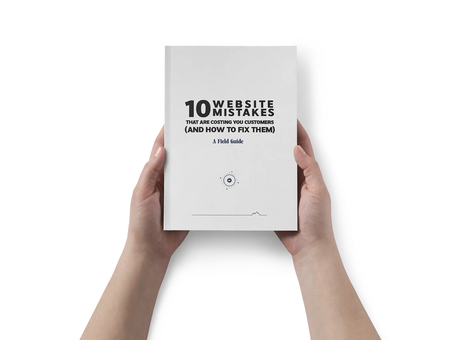
Go Deeper with our Free Guide – Take the First Step Now
Download our free eBook that uncovers common website pitfalls and how to avoid them.
A Non-Responsive Website Drives Away Mobile Users

💡 Solution: Mobile responsiveness should be a priority in website design for your company to improve accessibility and user satisfaction. Use a responsive design framework that adjusts content for different screen sizes.
Poorly Structured Content Makes It Hard to Read Your Company’s Website

Readability Issues That Hurt Your Website
- Walls of text discourage visitors from reading.
- Fixed font sizes reduce accessibility.
- No clear headings, subheadings, or bullet points for easy scanning.
💡 Solution: Use proper formatting, clear headings, and easy-to-read fonts to enhance readability in your company’s website design.
Ignoring Accessibility Limits Your Audience in Website Design for Your Company

Common Accessibility Mistakes
- Missing alt text for images excludes visually impaired users.
- Poor contrast and small fonts make reading difficult.
- No keyboard navigation support for users with disabilities.
Quick Accessibility Checklist
✔ Add descriptive alt text to all images.
✔ Use high-contrast color schemes for readability.
✔ Ensure all interactive elements are keyboard accessible.
✔ Provide captions and transcripts for multimedia content.
✔ Avoid using small or fixed-size fonts that limit readability.
✔ Include clear, structured headings to aid screen readers.
💡 Solution: Inclusive website design for your company ensures all users can access and engage with your content. Follow Web Content Accessibility Guidelines (WCAG) to create an accessible experience.
Go Deeper with our Free Guide – Take the First Step Now
Download our free eBook that uncovers common website pitfalls and how to avoid them.
Weak or Missing Calls-to-Action (CTAs) Reduce Conversions for Your Company’s Website
CTA Mistakes That Kill Leads
- Unclear or missing CTAs confuse users about what to do next.
- Too many competing CTAs create decision fatigue.
- Poor CTA placement results in lost conversions.
💡 Solution: Strong CTAs in website design for your company help guide users toward action. Use action-driven language, contrast colors, and strategic placements to increase conversions.
Distracting Elements Make Visitors Leave Your Site
What Annoys Website Visitors?
- Overuse of pop-ups disrupts browsing.
- Auto-playing videos or sounds annoy users.
- Too many animations slow the page down.
💡 Solution: Clean, user-friendly website design for your company keeps visitors engaged without unnecessary distractions. Prioritize simplicity and a smooth user experience.
Missing Key Business Information Hurts Credibility
What Should Be on Your Website?
- No visible contact details make it hard for customers to reach you.
- A generic 404 error page frustrates visitors.
- Unclear brand messaging weakens your company’s identity.
Examples of Well-Designed Contact Pages
A great contact page should be easy to find, provide multiple contact options, and reinforce trust. Here are a few examples of effective contact pages:
- Apple – A clean and intuitive contact page with clear navigation, direct support links, and an easy-to-use search feature.
- Zendesk – Offers a multi-channel support approach with a contact form, FAQs, and direct support chat options.
- Nike – Displays a well-structured contact page with localized support numbers, social media links, and an FAQ section.
💡 Solution: A professional website design for your company should include clear branding, easy-to-find contact details, and a custom 404 page that keeps users engaged even when they land on an error page.
The #1 Mistake in Website Design for Your Company
A Lack of Clarity
The biggest mistake in website design is a lack of clarity. Visitors want to instantly understand what your company does, how you can help them, and what they should do next. If your messaging is unclear or confusing, potential customers will likely give up and leave.
Donald Miller in “Marketing Made Simple” says clear messaging is key. A nice website is great, but clear communication grabs attention. It turns visitors into customers. So, ensure your website clearly shows its purpose and value.
At EV Agency, we value clarity and aesthetics for a successful website. We ensure your site looks professional and effectively conveys your message.
Key Components of Our Web Design Framework
Header/Hero Section
This is the initial impression visitors have of your site. An effective hero section promptly addresses three vital questions:
- What you’re offering: Clearly state your primary product or service.
- How it benefits the customer: Explain how your solution addresses their problems or enhances their lives.
- A clear next step: Encourage visitors to take action with a prominent call to action (CTA) like “Schedule a Call” or “Get a Free Quote.” Given that many users may not scroll beyond this section, a compelling CTA is essential.
Your Unique Value
Articulate what differentiates your product or service and how it caters to customers’ needs. This segment demonstrates why your offering is the optimal choice and highlights the tangible outcomes customers can anticipate.
What’s at Risk
If customers opt against your solution, they may encounter several challenges:
- Increased Costs: They might spend more on less efficient alternatives.
- Time Delays: Projects could take longer without your solution.
- Lower Quality: They may end up with a product that doesn’t meet their expectations.
- Limited Support: They might miss out on dedicated customer service and assistance.
- Competitive Disadvantage: Competitors using your solution could gain an edge.
Emphasizing these risks helps visitors understand the urgency and necessity of your solution.
The Expert Advice
Position your brand as a trusted authority that comprehends your audience’s needs and offers effective solutions. This builds trust and reassures visitors that they’re in capable hands.
The Simple Plan
Provide a straightforward roadmap to guide customers in engaging with your business. For instance, our three-step plan for your website includes:
- Book Your Free Consultation: Click “Book Free Consultation” and provide your details.
- Join Us for Your Free Consultation: Participate in a 30-minute session to discuss your website goals and clarify your vision.
- Get Your Result-Driven Website: Allow EV Agency to develop a site that attracts customers and boosts conversions effortlessly.
How We Do It
EV Agency crafts effective websites that deliver tangible results. We utilize the StoryBrand framework, refining your messaging and aligning it with engaging web design.
Our focus addresses critical business challenges such as low engagement, ambiguous messaging, and weak conversion rates. Our objective is to create websites that showcase your unique value and motivate customers to act.
Incorporating Videos
Videos significantly enhance user engagement and trust. Integrating concise, impactful videos, like customer testimonials or explainer clips, adds a personal touch to your website.
This fosters an emotional connection with your audience and can elevate conversion rates.
Transparent Pricing
Clear pricing options simplify the decision-making process for customers.
This enables them to select the plan that best aligns with their goals and budget.
The Footer – Your Resource Hub
The footer serves as a valuable resource hub, encompassing FAQs, contact information, social media links, and more.
This section provides essential information for visitors, enhancing their experience while maintaining a clean main website.
The Bottom Line
By integrating these thoughtful elements, EV Agency ensures your website communicates your brand message clearly, builds trust with visitors, and transforms traffic into satisfied customers.
Offering clarity, strong messaging, and appealing design, we are the ideal partner for businesses aiming for digital success.
Quick Recap: What Makes for Bad Website Design for Your Company?
Bad website design can negatively impact user experience, search engine rankings, and conversions.
Some common characteristics of poor design include:
- Lack of Clarity – Not communicating your brand message clearly, building trust with visitors, and turning traffic into satisfied customers.
- Cluttered Layouts – Overloading pages with too many elements makes navigation confusing.
- Slow Load Times – Unoptimized images, poor hosting, and excessive plugins slow down your site.
- Non-Responsive Design – A site that isn’t mobile-friendly discourages visitors from engaging.
- Inconsistent Branding – Using different colors, fonts, or messaging confuses visitors and weakens brand recognition.
- Poor Readability – Large blocks of text without clear headings and formatting make content hard to digest.
Avoiding these pitfalls ensures a better user experience and improved business performance.
What Are the 7 Steps to Building a Good Website for Your Company
Creating an effective website requires strategic planning and execution.
Follow these seven steps to build a website that attracts and retains visitors:
- Define Your Goals – Identify what you want your website to achieve (e.g., lead generation, brand awareness, sales).
- StoryBrand Wireframe – Structuring pages and navigation with clear messaging that drives conversions – ensuring visitors quickly understand what a company offers, how it helps them, and what action they should take next.
- Choose the Right Platform – Select a CMS (e.g., WordPress, Shopify, or a custom-built site) that fits your needs.
- Design for User Experience (UX) – Prioritize mobile responsiveness, readability, and accessibility.
- Optimize for SEO – Implement on-page SEO strategies, including meta descriptions, keyword-rich content, and fast load speeds.
- Test and Launch – Conduct usability testing, optimize performance, and fix issues before going live.
- Monitor and Improve – Use analytics tools to track performance and update content regularly.
By following these steps, you can create a website that meets business objectives while delivering a seamless experience for users.
Final Thoughts on Website Design for Your Company
A successful website is more than just looks—it should be fast, user-friendly, mobile-responsive, SEO-optimized, and accessible. Whether you’re launching a new site or improving an existing one, avoiding these mistakes will enhance website design for your company and drive better results.
A successful website is more than just looks—it should be fast, user-friendly, mobile-responsive, SEO-optimized, and accessible. Whether you’re launching a new site or improving an existing one, avoiding these mistakes will enhance website design for your company and drive better results.
EV Agency specializes in creating websites that are user-friendly, fast, and optimized for search engines.
Here’s how we help businesses avoid common web design pitfalls:
- Clarity – We help communicate your brand message clearly, build trust with visitors, and turn traffic into satisfied customers.
- Clear Navigation: We design intuitive menus with straightforward labels, ensuring visitors can easily find information without confusion.
- Fast Load Times: By optimizing images and selecting reliable hosting services, we ensure your site loads quickly, enhancing user experience and SEO performance.
- Mobile Responsiveness: Our designs adapt seamlessly to various devices, providing a consistent experience for all users, whether they’re on a desktop or smartphone.
- SEO Best Practices: We implement effective SEO strategies, including proper meta descriptions, alt text for images, and internal linking, to improve your site’s visibility on search engines.
- Accessible Content: Our team ensures your website meets accessibility standards, making it usable for all individuals, including those with disabilities.
A common mistake web designers make is focusing too much on looks and not enough on clarity. While a good design is important, it should not confuse users about what you offer and how it helps them.
For example, unusual navigation menus can seem creative, but they may confuse users. This confusion can cause frustration and higher bounce rates. Balancing visual appeal with user-friendly features is key to effective web design.
Bad website design often includes:
- Lack of Clarity – Not communicating your brand message clearly, building trust with visitors, and turning traffic into satisfied customers.
- Cluttered Layouts: Overcrowding pages with text and images makes it hard for users to focus on important information.
- Slow Load Times: Unoptimized media and poor hosting can lead to delays, causing users to leave the site.
- Non-Responsive Design: Websites that don’t adapt to different devices provide a poor experience for mobile users.
Inconsistent Branding: Using varying colors, fonts, or styles across pages can confuse visitors and dilute brand identity.
Building a successful website involves:
- Define Your Goals: Determine what you want to achieve, such as increasing sales or providing information.
- StoryBrand Wireframe – Structuring pages and navigation with clear messaging that drives conversions – ensuring visitors quickly understand what a company offers, how it helps them, and what action they should take next.
- Choose the Right Platform: Select a content management system (CMS) that fits your needs, like WordPress or Shopify.
- Design for User Experience (UX): Create a visually appealing layout that is easy to navigate and engages users.
- Develop Quality Content: Provide valuable, relevant information that meets the needs of your audience.
- Optimize for SEO: Implement strategies to improve search engine rankings, such as keyword optimization and meta descriptions.
- Test and Launch: Conduct thorough testing to ensure functionality across devices before going live.
Common mistakes when implementing design patterns are:
- Misapplying Patterns: Using a pattern inappropriately can lead to inefficient solutions.
- Overusing Patterns: Relying too heavily on patterns can result in overly complex designs.
- Ignoring Context: Not considering the specific problem context can make a pattern ineffective.
- Lack of Adaptation: Failing to tailor patterns to the project’s unique needs can limit their effectiveness.
- Neglecting User Needs: Focusing too much on patterns without considering user experience can lead to unusable designs.
Key considerations include:
- Understanding Your Audience: Tailor design and content to meet the preferences and needs of your target users.
- Setting Clear Objectives: Define what success looks like for your website to guide design decisions.
- Ensuring Accessibility: Design with inclusivity in mind to accommodate all users, including those with disabilities.
- Planning for Scalability: Ensure the design can accommodate future growth and additional content without major overhauls.
Common critical errors include:
- Ignoring User Feedback: Not considering user input can lead to designs that don’t meet audience needs.
- Overcomplicating Design: Adding too many features or complex elements can overwhelm users.
- Neglecting Mobile Users: Failing to optimize for mobile devices can alienate a significant portion of visitors.
Elements that contribute to poor website performance include:
- Broken Links: Non-functional links frustrate users and harm credibility.
- Inconsistent Design: Lack of uniformity in design elements can confuse users.
- Poor Content Structure: Unorganized content makes it difficult for users to find information.
Google Analytics, Google PageSpeed Insights, GTmetrix, and Hotjar are great tools for tracking performance, user behavior, and identifying areas for improvement.
Keep Growing • More Dispatches from Basecamp

Discover the essentials of corporate website design, including best practices, top examples, and step-by-step guidance on building a high-performing site.

Learn why website development is crucial for your business. This guide covers everything from choosing a website builder to optimizing for SEO and ensuring long-term success.

Discover the best website builder for small business in 2025. Compare WordPress, Shopify, Wix, Squarespace, and more to find the perfect solution for your needs.

Discover how a web design agency can boost your SEO success through optimized site speed, mobile-first design, UX, and strategic video integration. Partner with experts to maximize your online visibility.

Discover the pros and cons of in-house vs. outsourced social media management. Explore which option is best for your business with insights from EV Agency.