Have you ever landed on a website that made you feel instantly at ease, almost like you were being guided effortlessly through a journey?
Or perhaps a website confused and frustrated you, causing you to abandon it after a few seconds. These experiences aren’t random—they result from carefully crafted web design that taps into the psychology of buyer behaviour.
In the rugged digital landscape, your website isn’t just a platform; it’s your survival gear.
It serves as the compass that guides potential customers through their decision-making process, subtly influencing how they interact with your brand and, ultimately, whether they choose to do business with you.
At EV Agency, we believe in navigating this digital wilderness with purpose. We help businesses like yours create websites that not only look good but also use the principles of psychology to engage visitors, build trust, and drive conversions.
In this article, we’ll dive into how web design shapes buyer decisions, exploring key psychological triggers like color psychology, visual hierarchy, and emotional connection.
We’ll equip you with the tools you need to make sure your website not only survives but thrives in the competitive digital marketplace.
Color Psychology in Web Design: Using the Right Tools to Guide the Way
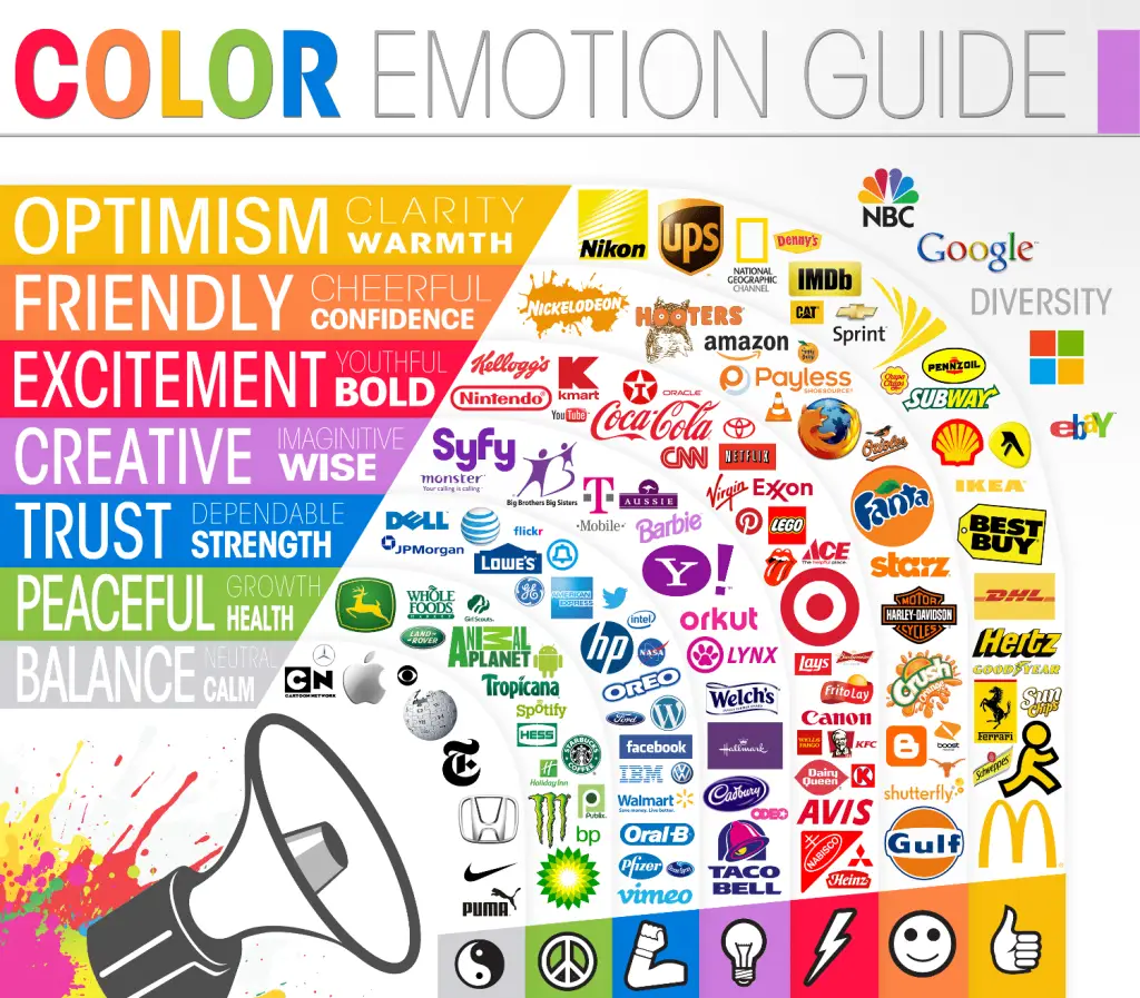
In the wilderness, different colors can signal important survival cues—bright red berries warn you to stay away, while clear blue skies offer a sense of calm and safety. The same principle applies to your website’s color scheme.

Why It Matters: Color psychology plays a significant role in influencing buyer decisions. Different colors evoke different emotions and reactions, guiding the way customers interact with your site.
For example, red is often used to convey urgency, making it a popular choice for “Buy Now” buttons.
At the same time, blue suggests trust and reliability, frequently used by financial institutions and healthcare companies.
Actionable Tip:
When designing your website, align your color choices with the emotional responses you want to evoke.
Use bolder colours like red and orange for your calls-to-action (CTAs) to create urgency and calming colours like green or blue for background elements to instill trust and calm.
Example:
Coca-Cola’s website employs a minimalist yet highly strategic design, primarily using white, off-white, and black tones to create a clean, uncluttered look.
This choice of neutral colors allows the bold red of the iconic Coca-Cola logo and its products to stand out dramatically.
Each product is colorfully highlighted, ensuring visitors’ attention is immediately drawn to the vibrant reds, greens, and other hues associated with the different beverages.
This contrast isn’t merely aesthetic—Coca-Cola leverages these colors to evoke excitement, energy, and nostalgia, emotions deeply tied to the brand. The minimalist layout also enhances user focus, guiding them toward the products while reducing distractions.
This design effectively engages visitors on an emotional level, while the eye-catching use of red and color for each product fosters a sense of urgency and action.
Through this thoughtful use of design and color, Coca-Cola successfully amplifies brand recognition, emotional engagement, and user interaction.
The Importance of Visual Hierarchy Design: Charting a Clear Path

Imagine hiking through an unmarked trail without any signs or guides—frustrating, right?
That’s what happens when a website lacks visual hierarchy. Users get lost, and they leave without ever reaching the goal.
Actionable Tip: Prioritize key elements on your website by adjusting their size, color, and placement. For example, your primary CTA button should be larger and more noticeable than other elements.
The hierarchy should guide users down the page in a logical order—from the headline to supporting information, and finally, to the CTA.
Example:
Apple’s product pages are a masterclass in visual hierarchy and intuitive design. When you land on a product page, your attention is immediately captured by large, high-quality images that showcase the products in a clean, minimalist layout.
These visuals are paired with concise, powerful headlines that communicate key product features at a glance, followed by clear and action-oriented CTAs, guiding users effortlessly toward the next step in the purchasing process.
Above the product section, Apple offers a well-structured navigation menu, which includes options like Shopping Guides, Ways to Save, Accessories, Setup and Support, and Special Stores.
Each link anchors to specific sections on the same page, ensuring that users can quickly find relevant information without feeling overwhelmed.
This organized layout creates a seamless, frictionless user experience, where every step is logically presented, helping users make informed decisions while feeling in control of their journey.
The design not only engages users but subtly directs them toward completing their purchase, reinforcing Apple’s reputation for blending form and function.
Creating Emotional Connections: Building a Campfire Experience

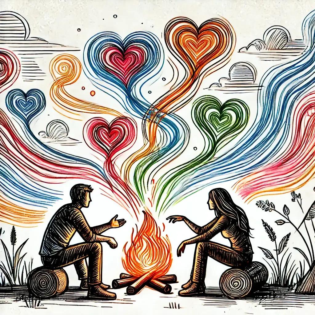
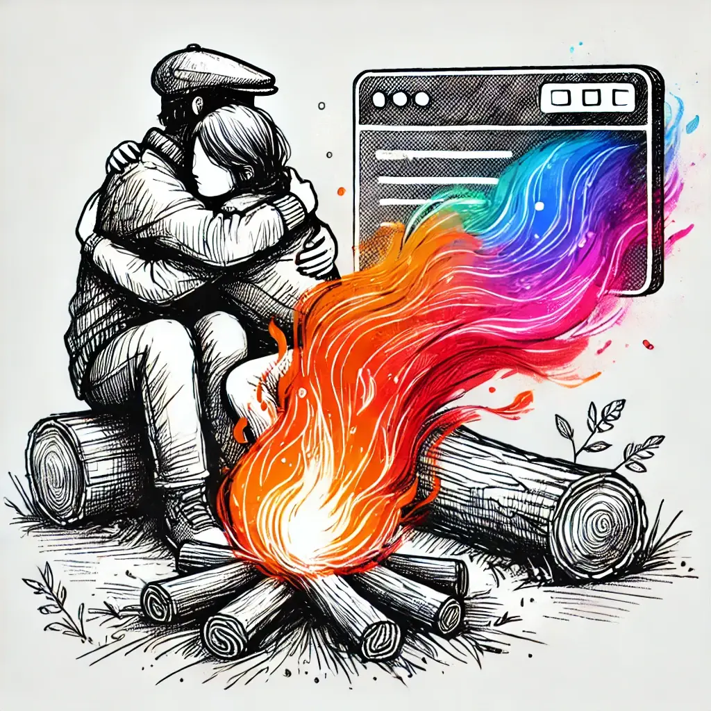
Just as sitting around a campfire fosters warmth and connection, a well-designed website can create emotional bonds between your brand and its visitors.
Why It Matters: People are emotional beings, and we often make decisions based on how something makes us feel.
When visitors feel an emotional connection to your brand, they’re more likely to trust you, engage with your content, and ultimately make a purchase.
Actionable Tip: Use high-quality images, relatable messaging, and personal stories to evoke the emotions you want your visitors to feel.
If your brand values sustainability, use imagery of nature and eco-friendly elements to connect with environmentally conscious consumers.
Example:
Patagonia excels at building emotional connections by conveying the lifestyle of its brand and ideal customers through powerful, immersive visuals.
The imagery portrays rugged outdoor adventures—hiking through vast landscapes, surfing, and climbing—that align perfectly with the aspirations of their target audience.
Each photo invites viewers to see themselves embracing an active, outdoor lifestyle, echoing the brand’s identity as more than just clothing or gear, but a gateway to exploration and adventure.
These visuals allow potential customers to imagine how Patagonia’s products fit seamlessly into their own journeys, helping them feel connected to a lifestyle of authenticity, exploration, and adventure.
The Power of CTA Buttons: Paving the Way to Action in Web Design

CTAs are the trail markers of your website, showing visitors the way to their next step.
Without clear, compelling CTAs, your users might lose their way or decide to turn back.
Why It Matters: A well-designed CTA can dramatically increase conversions.
Whether it’s signing up for a newsletter, downloading a guide, or making a purchase, the CTA is where the magic happens. Its design, color, and placement can make or break the user’s decision to engage with your brand.
Actionable Tip: Make sure your CTAs are highly visible and use action-oriented language that clearly communicates the benefit.
For example, instead of using “Submit,” opt for more engaging phrases like “Get Started” or “Claim Your Free Trial.”
Example:
Dropbox’s simple yet effective “Sign up for free” CTA is prominently placed and easy to understand.
The combination of a contrasting color and clear language invites visitors to take immediate action without hesitation.
Optimizing User Experience: Clearing the Path

In any adventure, smooth terrain makes the journey more enjoyable. Similarly, a seamless user experience (UX) on your website ensures visitors can find what they need with minimal friction.
Why It Matters: Good UX is essential for keeping visitors on your site and guiding them toward conversion. Poor navigation, slow loading times, and cluttered layouts will cause users to abandon your site in frustration. On the other hand, a clean, well-organized website helps build trust and keeps visitors engaged.
Actionable Tip: Ensure your website is easy to navigate with a simple, intuitive menu and a clear structure. Regularly test your website’s performance across devices to make sure it loads quickly and works smoothly on both desktop and mobile.
Example:
Airbnb’s website prioritizes UX with a clean design, intuitive search functions, and a mobile-friendly interface. The smooth, frustration-free experience keeps users coming back to find their next adventure.
A Web Design Agency
In the unpredictable digital wilderness, having a reliable guide can make all the difference. At EV Agency, we’re not just digital marketers—we’re your digital marketing outfitters, here to guide you through the complex terrain of web design, user experience, and buyer psychology.
We’ll help you light your brand’s campfire and keep it burning bright, drawing customers in and converting visitors into loyal advocates. Whether it’s optimizing your CTAs, refining your visual hierarchy, or crafting an emotional connection with your audience, our team has the tools and expertise to help your business thrive.
Contact EV Agency today to start building a website that influences buyer decisions and keeps your customers coming back for more.


