
If your website is a trailhead, the first screen is the sign at the parking lot.
People show up, look around, and decide fast:
- Is this the right trail?
- Is it safe?
- Do I want to keep going?
That first screen is Above the Fold. And in web design and marketing, it can make the difference between someone sticking around or bouncing back to Google in two seconds.
Let’s break it down in plain language and make it practical.
TL;DR: Above The Fold
- Define above the fold as the first screen; state who it’s for, what you do, and the outcome.
- Place one primary CTA above the fold, backed by quick proof: reviews, guarantees, logos.
- Go mobile-first: keep headline and CTA visible at key breakpoints; avoid clutter and false bottoms.
- Match ads, email, and search intent above the fold so visitors know they’re in the right place.
- Speed up above the fold: compress hero images, delay scripts, and prioritize fast loading for better conversions.
Above the fold meaning
One-sentence definition
Above the fold means the part of a webpage people see right away, before they scroll.
In the old newspaper world, “the fold” was a literal fold in paper. On websites, or email campaigns, it’s the bottom edge of what your screen shows on first load.
What “the fold” means now (it changes by device and viewport)
Here’s the tricky part: there is no single fold anymore.
A phone, a tablet, a laptop, and a big desktop monitor all show different amounts of content. Even two people on the same phone model can have different “folds” if they changed text size or zoom settings.
So today, Above the Fold really means:
- The first screen on that device
- In that browser window
- At that moment
That is why smart design is responsive and tested across breakpoints, not guessed.
Above the fold vs below the fold (simple comparison)
Think of it like this:
- Above the Fold: The hook. The promise. The “you’re in the right place” moment.
- Below the Fold: The proof. The details. The story that earns the click, call, or purchase.
Above the Fold gets people to take the next step (scroll, click, read). Below the fold closes the loop.
Is above the fold still relevant?
The real answer: people scroll, but they decide fast
Yes, people scroll. We all do.
But here’s what still hasn’t changed: people judge fast.
Nielsen Norman Group puts it this way: “users will scroll, but only if what’s Above the Fold looks promising.”
And their research has repeatedly found that people spend more attention and time on what they see first than what’s farther down the page.
So the modern truth is:
- Scrolling is normal.
- Earning the scroll is the job.
What above-the-fold is actually responsible for (3 jobs)
A strong Above the Fold section does three jobs, in order.
1) Confirm they are in the right place
When someone lands, your page should instantly answer:
- “Is this for me?”
- “Is this what I clicked for?”
If they came from Google, they should see the same topic and language they searched. If they came from an ad, the page should match the promise of the ad. That’s called message match, and it’s a conversion lifesaver.
2) Explain the value fast
This is where your headline and supporting line matter.
You are not trying to tell your whole life story up top. You are simply saying:
- What you do
- Who you help
- What result they can expect
Shopify calls this your “one and possibly only opportunity to make an impression.” Shopify
3) Point to the next step
Above the Fold should not feel like a dead end.
It should clearly guide action:
- Scroll for details
- Book a call
- Shop the collection
- Add to cart
- Get a quote
The visitor should never be thinking, “Okay… now what?”
When above the fold matters most (cold traffic, ads, search, social)
Above the Fold matters most when the visitor is “cold,” meaning they do not know you yet:
- Paid ads: fast decision, low patience
- Google search: they are comparing options
- Social traffic: they are in scroll mode already
- PR or referral: they are curious, but skeptical
In all those cases, Above the Fold is your first handshake. If it’s weak, the meeting ends there.
Above the fold in web design (what belongs there)
The “first screen” checklist (the 5 essentials)
If you want a simple rule: treat Above the Fold like a mini landing page.
Here are the five essentials that win on most sites.
1) Clear headline
A strong headline is specific and obvious.
Not: “Welcome to our website.”
Instead:
- “Rubber tracks that fit right the first time.”
- “Calgary bookkeeping for small business owners.”
- “Commercial drone inspections for construction sites.”
A good headline helps people self-select fast.
2) Support line that makes it specific
Your support line adds clarity. It answers the question: “Okay, how do you help?”
Examples:
- Lead time, locations served, specialty, or guarantee
- One or two benefits that matter most
Keep it short. Two lines is usually enough.
3) One primary CTA
One page should have one main action.
If you put five buttons up top, people often do nothing.
Common primary CTAs:
- Book a call
- Get a quote
- Shop now
- See pricing
- Start free trial
BigCommerce even calls out placing the CTA above the “digital fold” as a standard landing page move.
4) Proof and trust signals
People do not trust you yet. So give them quick proof:
- Star rating or review count
- Customer logos
- “Trusted by 1,200 contractors”
- Certifications, awards, or guarantees
- Shipping and returns reassurance (for ecommerce)
This is not about bragging. It is about reducing risk.
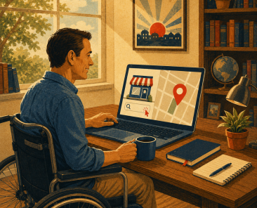
5) A visual or layout cue that supports the message
Visuals matter because people process them fast.
This could be:
- Product in use photo
- Short demo clip (careful with speed)
- Clean illustration
- A simple layout cue that shows there is more below (more on that later)
Shopify recommends using visuals to enhance engagement, but also warns you to keep it clean and avoid clutter.
What does not belong above the fold (common conversion killers)
Here are the usual Above the Fold traps that kill clarity:
- Huge hero image with no message
- Sliders/carousels (often slow, often ignored)
- Three competing CTAs
- Walls of text
- Stock photos that say nothing
- Popups immediately on arrival (especially on mobile)
If you want to use a popup, consider delay, scroll-trigger, or exit-intent instead. Also, Google has specific guidance on avoiding intrusive interstitials, especially for mobile search visitors.
Desktop vs mobile priorities (what changes)
Desktop gives you more room. Mobile gives you less patience.
On mobile, your Above the Fold might only show:
- Headline
- A hint of the support line
- One CTA
- Maybe a small trust cue
So mobile priorities usually become:
- Shorter headline
- Less navigation clutter
- Stronger CTA visibility
- Faster loading visuals
- Tap-friendly buttons
If your mobile header takes up half the screen, your message is already buried.
Above the fold digital marketing (why marketers care so much)
This is the part most business owners feel in their gut.
You can spend money on ads, SEO, content, and social… but if the first screen does not land, your traffic leaks out like a hole in a fuel can.
That is why Above the Fold digital marketing is a real thing. Marketers care because Above the Fold decides whether your campaigns turn into leads, sales, and booked calls.
Message match (ad, email, social, and search)
Message match means: what they clicked should be what they see.
Examples:
- If the ad says “Free discovery flight,” your headline should mention discovery flights.
- If the search term is “rubber tracks for skid steer,” do not lead with “Welcome.”
- If the email promotes “15% off 4 tracks,” show that offer immediately.
When message match is strong, bounce rate drops and lead quality improves because the right people stay.
Funnel intent and above-the-fold goals
Different pages have different jobs, so Above the Fold should change too.
Homepage: orient and route
Homepage Above the Fold should:
- Explain what you do
- Who it’s for
- Route visitors to the right next step
A homepage is not one conversation. It’s a map.
Landing page: one goal, one CTA
Landing pages exist to do one thing.
So Above the Fold should be laser-focused:
- One offer
- One CTA
- Proof that supports that offer
Service page: trust and proof
Service pages need to reduce risk fast:
- What the service is
- Who it helps
- Why you are credible
- What happens next
Product page: decision support
On ecommerce product pages, platforms and experts repeatedly push the same idea: keep the buying essentials visible immediately.
That usually means:
- Product name
- Price
- Strong images
- Options/variants
- Add to cart
- Shipping/returns reassurance
Above-the-fold copy that improves lead quality (not just volume)
This is a big one.
A lot of websites accidentally attract “bad fit” leads because their Above the Fold messaging is too vague.
If your headline says “We do marketing,” you will get:
- People with tiny budgets
- People looking for free advice
- People who want you to do everything tomorrow
But if your Above the Fold says:
- “Conversion-focused websites and SEO for trades and industrial companies”
Now you filter.
You still get leads, but they tend to be closer to your real customer.
Examples of “good fit” vs “bad fit” traffic and how the first screen filters it
Here are simple examples.
Example 1: Local service business
Bad fit headline: “Quality service you can trust.”
Good fit headline: “Emergency furnace repair in Edmonton. Same-day appointments when available.”
That filters out people in other cities and people looking for new installs only.
Example 2: B2B services
Bad fit headline: “We help you grow.”
Good fit headline: “Fractional CFO support for companies doing $1M to $10M in revenue.”
That filters out startups with no revenue and focuses on serious buyers.
Example 3: Ecommerce
Bad fit Above the Fold: Big lifestyle image, no price, no shipping info, no CTA.
Good fit Above the Fold: Product image + price + “In stock” + “Ships in 1 to 2 days” + Add to cart.
That filters out window shoppers who get frustrated and bounces fewer high-intent buyers.
Where is “the fold” today? (and how to design for it anyway)
Why there is no universal fold line
There is no universal fold because:
- Screen sizes vary
- Browser windows vary
- Toolbars and menus vary
- Accessibility settings vary
So chasing a single “fold line” is a losing game.
Instead, aim to protect the essentials.
Practical design approach
Mobile-first layout
Design mobile first because it forces discipline.
If it works on a small screen, it usually works everywhere.
Breakpoints that protect the headline and CTA
At common breakpoints, make sure:
- Headline is visible
- CTA is visible
- Support line is not pushed too far down
- Navigation is not taking over
Avoid “false bottoms” that look like the page ends
A false bottom happens when the first screen looks “complete,” so people do not realize there is more.
CXL talks about this problem in the context of Above the Fold design and “false bottoms.” CXL
Fix it with simple cues:
- A cut-off section peeking from below
- A subtle arrow
- A photo that continues
- A line of copy that hints at what’s next: “See pricing and availability below.”
Quick way to check your own fold across devices (simple steps)
Do this today:
- Open your page in Chrome.
- Right-click, choose Inspect.
- Toggle device toolbar (mobile icon).
- Flip through a few devices (iPhone, Android, tablet).
- Ask one question: Do I see the headline, key value, and CTA without scrolling?
- Repeat on desktop with different window sizes.
If you want to go deeper, use heatmaps and session recordings later. But this quick check catches the big problems fast.
Ecommerce above-the-fold examples (what top stores prioritize)
Ecommerce is where Above the Fold gets real, because money is right there on the page.
Product pages
On product pages, the pattern is consistent across strong stores:
- Images first (clear, high quality)
- Product name
- Price
- Variant selection (size, color, tread pattern)
- Add to cart
- Shipping and returns reassurance
- Social proof (reviews)
Shopify’s guidance on product pages emphasizes keeping “what you’re selling,” “what the customer gets,” and “how they get it” above the fold.
Category pages
Category pages are not about one product. They are about finding the right product.
So Above the Fold should focus on:
- Clear category title (“Skid Steer Rubber Tracks”)
- Sorting and filters that are easy to use
- Products visible quickly (not hidden under giant banners)
If shoppers cannot see products fast, they bounce.
Checkout and cart
Cart and checkout Above the Fold should do two things:
- Reduce distractions
- Increase reassurance
That means:
- Clear totals
- Clear shipping/tax info
- Clear next step button
- Trust cues (secure checkout)
- Remove extra navigation if it pulls people away
This is not the place for big promos or random popups.
What to copy from major platforms (Shopify, WooCommerce patterns)
You do not need to reinvent the wheel.
- Shopify’s Above the Fold advice focuses on putting crucial information first, writing sharp headlines, using visuals carefully, selecting the right CTA, and avoiding clutter. Shopify
- WooCommerce also calls out keeping important images, text, and CTAs above the fold while still giving content breathing room. WooCommerce
The big takeaway: clean, clear, and purchase-ready beats “fancy.”
How above-the-fold design improves conversion rates
The clarity formula (plain-language framework)
If you only steal one framework from this article, steal this.
Your Above the Fold should answer four questions fast:
What it is
Name it. No clever mystery.
Who it is for
Call out the audience.
What problem it solves
Show the pain you remove or the outcome you deliver.
What to do next
Give one next step.
That is clarity. And clarity converts.
Trust signals that belong near the top
Put trust where doubt happens, which is at the start.
Good trust signals near Above the Fold:
- Review stars and count
- “As seen in” (only if real)
- Case study link
- Warranty or guarantee
- Security badges (ecommerce)
- Delivery timeline
NN/g’s research supports the idea that the top of the page drives attention and sets the decision to continue.
CTA placement rules that actually work
People love to argue: “CTA above the fold” vs “CTA after proof.”
The real answer is: it depends on certainty.
- If the offer is simple and the visitor is ready, CTA early works.
- If the offer is complex and needs trust, CTA plus proof often wins.
A good compromise that works on many pages:
- Primary CTA above the fold
- Proof close by (rating, short testimonial, numbers)
- Repeat CTA after deeper proof below
Using scroll cues to earn the next step
Scrolling is a micro-commitment.
You earn it by:
- Hinting there’s more
- Creating visual momentum
- Making the next section look interesting
It is like seeing the trail continue past the trees. If it looks well-marked, you keep walking.
Performance and speed (above-the-fold content must load fast)
Why speed hits conversions (in plain language)
If Above the Fold is slow, your first impression is “this feels broken.”
Also, speed is not just a tech issue anymore. Google measures real user experience signals like Core Web Vitals.
One big one is Largest Contentful Paint (LCP), which measures how fast the biggest element in the viewport appears. In plain terms, your main Above the Fold content needs to show up fast.
Common causes of slow above-the-fold rendering
Heavy hero images
Huge uncompressed images are a common culprit. They often become the LCP element, so they control perceived load speed.
Sliders
Sliders often load multiple images and scripts. You pay the speed cost even if people never interact with it.
Too many scripts
Chat widgets, analytics, ads, popups, sliders, fancy animations. They stack up fast and delay the first screen.
Fixes that usually move the needle
Compress and properly size images
Do not upload a 5000px image to display it at 1200px.
Use modern formats when possible and size images to the actual layout.
Delay non-critical scripts
If the script is not needed for the first screen, load it after.
Prioritize the first screen assets
Treat Above the Fold like a priority lane:
- Critical CSS first
- Main hero image optimized
- Fonts handled cleanly
- Everything else can wait
SEO risks and rules (what can hurt rankings above the fold)
Too many ads before content (top-heavy layouts)
Google has directly addressed pages that load the top of the screen with too many ads and make it hard to find the real content.
Even if you are not a publisher site, the principle still applies: if the first screen is cluttered and unhelpful, users bounce. That is never good for SEO.
Intrusive popups on arrival (especially mobile)
Google has also warned about intrusive interstitials that block content for users coming from mobile search.
So if you are running a popup, be careful about:
- Full-screen blockers on first load
- Hard-to-close overlays
- Anything that hides the content they clicked for
Thin content and unclear intent match
If your Above the Fold is vague, people pogo-stick back to search.
That sends a signal that your result did not satisfy intent. The fix is usually not “more SEO tricks.” The fix is clearer messaging.
Accessibility and readability issues (font size, contrast, tap targets)
If people cannot read it or tap it, they leave.
Basic checks:
- Font size readable on mobile
- Buttons large enough
- Good contrast
- Clear spacing
Accessibility is not just a nice-to-have. It supports usability, and usability supports performance.
How to test and improve above-the-fold (step-by-step)
What to measure (pick 3–5)
Do not measure everything. Pick a few signals that match your goal:
- CTA clicks (button clicks, add to cart)
- Scroll depth (are people moving past the first screen?)
- Bounce rate or engagement (depends on analytics setup)
- Form starts (not just submissions)
- Conversion rate (the real win)
What to A/B test first (highest impact)
Start where the leverage is.
Headline
Small wording changes can have big outcomes because headline is the first filter.
CTA copy
“Get a quote” vs “See pricing” can change lead quality.
Proof placement
Move reviews or trust badges closer to the CTA.
Hero visual
Test product-in-use vs plain product shot. Test photo vs short video (only if fast).
Layout density
Too tight feels stressful. Too empty feels unhelpful. Find the sweet spot.
A simple 30-day testing loop you can repeat
Here’s a no-drama loop:
Week 1: Baseline
- Record current conversion rate and CTA clicks
- Screenshot Above the Fold on mobile and desktop
Week 2: Change one thing
- One change only: headline or CTA or proof placement
Week 3: Let it run
- Do not touch it daily
- Watch for directional movement
Week 4: Decide
- Keep the winner
- Document what changed
- Queue the next test
Repeat monthly. Over a year, that compounds.
Above-the-fold wireframes you can copy (by page type)
These are simple layouts you can sketch on paper before you design.
Service business homepage wireframe
Top to bottom:
- Logo + simple nav
- Headline (what you do + result)
- Support line (who it’s for + where)
- Primary CTA (Book call)
- Secondary link (See services)
- Proof row (reviews, logos, “trusted by”)
- Hero visual (team, work, outcome)
- Scroll cue (next section peeking)
Local service landing page wireframe
Top to bottom:
- Headline (service + city)
- 3 bullet benefits (fast, warranty, financing, etc.)
- Primary CTA (Call or Book)
- Trust (reviews, badges)
- Small map or service area note
- Short form or “get quote” button
- Scroll cue into proof/testimonials
Ecommerce product page wireframe
Left/right on desktop, stacked on mobile:
- Image gallery
- Product name
- Rating + review count
- Price + stock status
- Variant options
- Add to cart
- Shipping/returns reassurance
- Payment options (if helpful)
This aligns with Shopify’s common product page guidance for Above the Fold essentials.
Lead magnet wireframe
Top to bottom:
- Headline (what they get)
- 2 to 4 bullets (what’s inside)
- Form fields (minimal)
- CTA (Download)
- Trust cue (privacy note, “no spam”)
- Preview image of the lead magnet
- Scroll cue into “why it matters”
Conclusion (the fold is your first promise)
Above the Fold is not a line you obsess over. It’s a promise you make.
A visitor shows up and asks three questions fast:
The 3-question wrap-up
What is this?
Say what you do in plain language.
Why should I care?
Show the benefit and the outcome.
What do I do next?
Give one clear next step.
That’s it. That is the whole game.
Next action checklist (audit 5 pages, test 1 change)
Do this next:
- Audit 5 key pages (homepage, top service page, top landing page, top product page, checkout/cart).
- Screenshot the Above the Fold on mobile and desktop.
- Fix the biggest clarity problem first (usually headline or CTA).
- Run one A/B test for 30 days.
- Keep the winner and repeat.
If you want a trail-guide approach to this, build a simple testing rhythm and let data pick the path forward.
Keep Learning
FAQ: Above The Fold
The above the fold meaning in web design is the part of the page people see right away, before they scroll. It matters because it creates the first impression and helps people decide if they should keep reading or take action.
Keep it simple and focused:
- Clear headline that matches the traffic source
- Short support line
- One primary CTA
- Proof close to the CTA (reviews, results, logos)
- Visual that supports the offer
Landing pages work best when Above the Fold is a mini pitch that earns the click or scroll.
Above the fold in digital marketing is the first screen people see after they click from Google, ads, social, or email. Marketers care because that screen decides whether the visitor stays, scrolls, clicks the CTA, or leaves.
Often yes, but not always.
A good rule:
- If the offer is simple and people are ready, put the CTA above the fold.
- If the offer is complex, still place the CTA above the fold, but pair it with quick proof and clarity so it does not feel pushy.
BigCommerce even recommends placing the CTA at the top of landing pages as a standard conversion practice.
Start with a simple A/B test:
- Version A: current Above the Fold
- Version B: change one element (headline, CTA copy, proof placement, hero image)
Measure CTA clicks, scroll depth, and conversion rate. Keep winners, document results, repeat monthly.
It can.
Not because of a magic “fold ranking factor,” but because:
- User experience affects engagement
- Engagement affects outcomes like bounce-back behavior
- Google also has specific guidance on ad-heavy layouts and intrusive interstitials that hurt accessibility to content
On mobile, Above the Fold is usually just a small slice of your page.
That means you need:
- A shorter headline
- A clear CTA
- Minimal clutter
- Fast loading visuals
Mobile-first design helps you protect the essentials.