Learning to fly starts with questions. Which licence do you need? What does training cost? How do you take the first step?
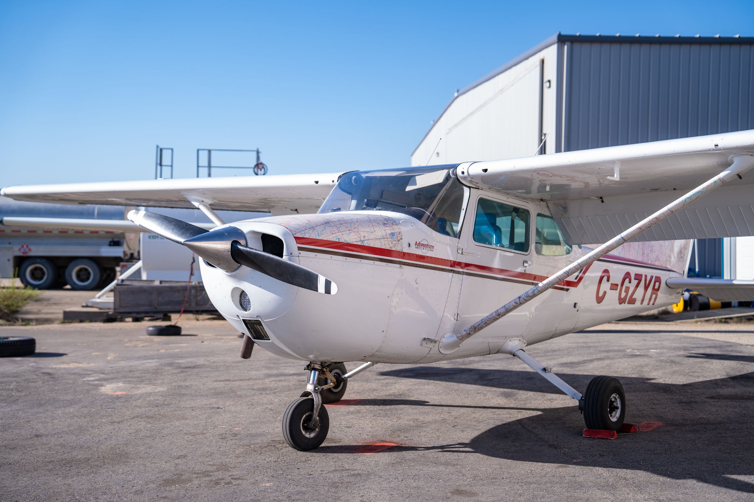
Adventure Aviation helps people explore those questions through flight training in Grande Prairie, Alberta, and Fort St. John, British Columbia. It also provides services for aircraft owners and operators.
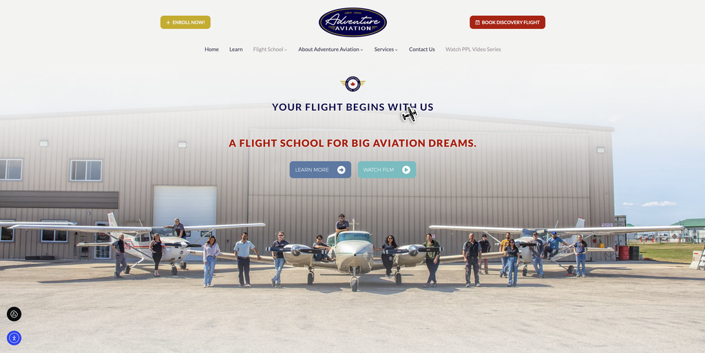
EV Agency worked with General Manager Adriano Lupini to rebuild the company’s website. The aim was to help visitors understand the training options, meet the people behind the business and find a clear next step.
That meant building an experience that felt welcoming to beginners while still giving experienced pilots and aircraft owners useful information.
TL;DR
- Built clear pages for flight training, course costs and aviation services.
- Brought real staff, students and training imagery into the website.
- Added desktop topic tabs, mobile accordions and custom aviation details.
- Created enquiry forms and tracking to support future marketing decisions.
What the Client Needed
Adventure Aviation serves people with different goals. Some want to experience their first flight. Others are planning a career in aviation or looking for aircraft services.
Each visitor needs a different starting point.
For future students, the website needed to explain courses, requirements and costs in plain language. It also needed clear ways to ask questions, enquire about a Discovery Flight or begin the enrolment process.
At the same time, the business needed forms to capture enquiries and tracking to understand how people used the site.
The goal was practical: help visitors find relevant answers and make it easy to contact the right team.
The Plan We Mapped Out
We worked through the website in stages, with Adriano’s input along the way.
- Map the customer journey with StoryBrand. We put future students at the centre of the story, with Adventure Aviation as their guide and clear next steps throughout.
- Agree on the design direction. The first homepage review focused on the look, layout and flow.
- Build out the content. Next, we developed the program and service pages, then reviewed the details and photos with the client.
- Refine desktop and mobile layouts. We adjusted navigation, video placement and page behaviour to suit different screens.
- Check forms and tracking. The final review included enquiry forms, follow-up task routing and website measurement.
Shared documents, questionnaires and review links gave the team clear places to leave feedback. Separating design, content and technical checks also kept each discussion focused.
This gave the project a steady rhythm, with room to make thoughtful changes as the site took shape.
What We Delivered
The website brought Adventure Aviation’s training programs, people and services into a consistent design.
Key parts of the build included:
- A rebuilt WordPress website: A platform for service information, training programs and educational content.
- Dedicated training pages: Clear destinations for Discovery Flights, pilot licences, ratings and international training.
- StoryBrand messaging and clear calls to action: A customer journey that answers questions and guides visitors toward a Discovery Flight, training information or an enrolment enquiry.
- A flight training costs page: Published estimates and rates to help prospective students plan their questions.
- Desktop tabs and mobile accordions: Topic navigation that breaks longer pages into manageable sections.
- Custom aviation details: An airplane cursor, spinning propeller transitions and prominent video.
- Staff portraits and a team page: A way for visitors to meet the instructors, maintenance staff and support team.
- Enquiry forms: Separate options for Discovery Flights, enrolment and general questions.
- Spam protection: Background checks designed to help block automated form submissions.
- Website tracking: Measurement for form submissions and clicks on phone and email links.
- A blog area: Space to publish useful flight training resources over time.
We also prepared form routing into Monday.com so enquiries could become follow-up tasks. This was included in the client’s final testing process.
Together, these features connected the information people were looking for with a clear way to get in touch.
How We Captured the Story (On-the-Ground Approach)
The website needed to reflect the people and experience behind Adventure Aviation.
We started with the writing. Someone new to aviation should be able to understand their options without already knowing the terms.
So the copy introduced training paths step by step. It gave visitors room to explore their questions before deciding what to do next.
Photography and video added another layer. Staff portraits, student images and training footage showed the school beyond its course descriptions. Visitors could see the people and setting behind the services.
The design also carried a few memorable aviation details. An airplane cursor and spinning propeller transition brought personality to the experience, while the hero video helped introduce the brand.
Navigation took careful thought. Adriano wanted visitors to move easily between topics, so we combined that idea with sliding content panels.
On desktop, visitors could select a topic tab. On mobile, those topics opened as a vertical accordion. We kept conventional scrolling on pages where it suited the content better.
Each choice served the same purpose: make the site feel like Adventure Aviation while keeping the information easy to explore.
A Few Lessons From This Project
Good website decisions start with understanding what visitors need.
This project reinforced five practical lessons:
- Answer questions before asking for action. People need to understand their options before they feel ready to enquire.
- Give each review a focus. Separate design, content and technical checks help everyone give more useful feedback.
- Plan for different screens. Desktop navigation may need a different approach on a phone.
- Show the people behind the business. Staff portraits give visitors a better sense of who they’ll work with.
- Build measurement into the project. Forms and tracking help a business understand what happens after someone visits.
For businesses with several services or complex offerings, these basics matter. Clear information and thoughtful navigation help people find a starting point.
About the Work
We built the website with WordPress and custom design features suited to Adventure Aviation.
The main tools included:
- WordPress: The platform for pages and articles.
- Elementor Pro and TheGem: Tools used to build and style the website.
- Google Tag Manager: A central place to manage tracking.
- Google Analytics 4: Measurement for website visits and key actions.
- Google Ads conversion tracking: Tags for form submissions and contact-link clicks.
- Google reCAPTCHA v3: Background spam protection for forms.
- Monday.com: Follow-up task routing prepared for form enquiries.
The technology supported the day-to-day needs of the site: sharing information, receiving enquiries and understanding visitor activity.
Ready to Build Something Like This?
Your website should make your business easier to understand. Whether you offer one service or several, we can help you organise the information, show the people behind the work and give visitors a clear next step.
Contact EV Agency to discuss your website. We’ll help you define the scope, shape the message and create strong visuals through a clear, calm process.