Some products solve a real problem so clearly that their value shows up the moment people understand how they work.
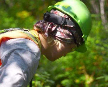
That was the case with Never Lost Trails. The app was built to help people navigate remote trail systems with more confidence, especially in places where cell service dropped off and getting turned around could quickly become a safety issue. Our job was to turn that practical value into a clear story people could understand fast.
The app is no longer available following the passing of its owner. Even so, this project remains a strong example of how thoughtful video storytelling can make a useful tool easier to understand, trust, and remember.
The Trailhead
Some projects matter because they help people make better decisions in the field. That was the heart of this one.
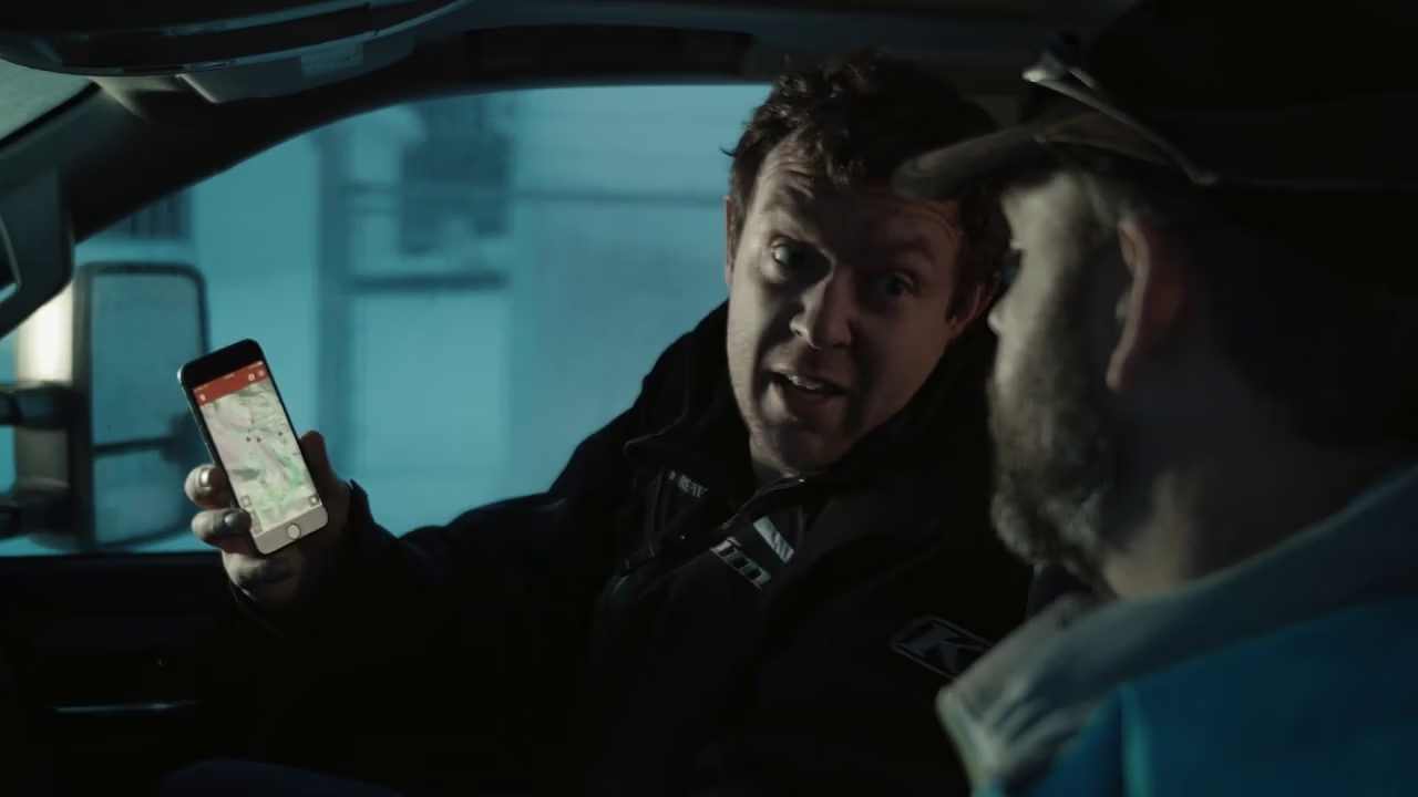
At the time of this project, Never Lost Trails was a smartphone app built to help people navigate remote trail systems with more confidence. It used a phone’s GPS while the device was in airplane mode, which meant users could still track their location in areas where cell coverage was weak or missing.
The commercial was created to explain that value in a clear, practical way. This was not just about promoting an app. It was about showing why the tool mattered before someone headed into the bush, onto the trail, or deeper into remote terrain where getting turned around can become a real problem.
The app is no longer available following the passing of its owner. Still, this project remains a strong example of how clear storytelling can help people quickly understand a useful product and the real-world problem it was built to solve.
What the Client Needed
At the start, the challenge was clear. The app had strong features, but those features needed a story people could grasp quickly.
The client needed a commercial that would both promote the app and explain its purpose. Viewers needed to understand that Never Lost Trails helps them know where they are at all times within supported trail systems. Just as importantly, they needed to see why features like GPS in airplane mode, distance between points, trail ratings, and terrain awareness matter in real life.
Success looked like a video that created need, not just awareness. It had to show how the app could help people travel with more confidence in remote areas. It also had to make technical details feel simple, practical, and easy to remember.
No confirmed timeline, budget, approval process, or production constraints were provided for this draft. Because of that, the strongest approach was to stay grounded in what is known and build the story around the real problem the app solves.
In the end, the need was straightforward. Explain the tool clearly enough that people can see its value right away.
The Plan We Mapped Out
Once the goal was clear, the next step was to shape a message that felt practical instead of overloaded. Good app marketing often comes down to removing confusion.
We started with the core benefit. The strongest promise was simple: helping people know their location in remote trail systems, even when cell service is not available.
From there, we simplified the technical explanation. GPS in airplane mode became a memorable reason to trust the app, not just a line in a feature list.
Next, we built the message around real use in the field. Trail colour ratings, distance between points, and terrain information all help users make better decisions, so the story had to show the app as a guide in actual trail conditions, not just a digital product on a screen.
Because this was a commercial, the structure also needed to move quickly. Each part of the message had to be easy to follow, with a clear path from problem to tool to value.
We also left room for review and refinement. Product videos work best when the message can be checked, simplified, and tightened before the final cut.
That plan mattered because it kept the project organized while protecting the message from becoming too technical. It created a clearer route from product feature to real-world value.
What We Delivered
The final deliverable needed to do more than look polished. It needed to explain the app in a way that felt useful from the first few seconds.
At the centre of the project was one commercial video built to promote Never Lost Trails and explain what it does.
We also shaped product-focused messaging that moved the story away from jargon and toward practical trail use. That helped the app feel more relevant to the people most likely to rely on it.
The commercial visually explained key features such as GPS use in airplane mode, trail colour ratings, and terrain awareness. That mattered because viewers needed to understand the app quickly, without having to decode technical language.
The final piece also gave the brand a marketing asset it could use to support awareness across digital channels.
No additional deliverables were confirmed, such as social cutdowns, app store assets, still photography, or paid ad variations. Even so, the core delivery was strong and focused: a commercial designed to help people understand what the app does and why they may need it.
How We Captured the Story (On-the-Ground Approach)
For a project like this, the story only works if it stays close to how people actually use the app. That shaped the whole approach.
We framed Never Lost Trails as a practical trail companion, not just a software product. The message needed to connect with the moment when someone is out in remote country, checking their phone for orientation, distance, or trail conditions. Because of that, clarity mattered more than flash.
One of the strongest visual tools in the app is its colour system. Green shows groomed trail systems, blue shows ungroomed trails, and black marks areas that may be dangerous because of avalanche exposure or highly technical terrain. When available, Avalanche Terrain Exposure Scale ratings are also shown. That gave the commercial a built-in visual language viewers could understand quickly.
We also kept the app’s strongest functional point front and centre. It works with an existing cellphone using GPS while the phone is in airplane mode. That feature is a major part of the app’s value, so it needed to stay at the centre of the story.
No confirmed drone use, interview setup, music direction, or gear list was provided for this project brief. Because of that, the strongest and most honest read is simple: the commercial worked because it treated the app as a practical navigation and trail-safety tool, not just another piece of tech.
A Few Lessons From This Project
This project reinforced a few practical lessons.
- Start with the real-world problem, not the feature list.
- Turn technical language into plain language people can absorb quickly.
- Use visual systems, like trail colours, to teach faster.
- Make the need obvious before you explain the tool.
- When safety and navigation are part of the story, clarity matters more than hype.
- Those lessons apply far beyond one app. Strong marketing often comes down to making something useful easier to understand.
Ready to Build Something Like This?
If your product solves a real problem but the message still feels hard to explain, we can help.
Eagle Vision Agency creates clear, grounded content that helps people understand what you do and why it matters. Whether you need a commercial, an explainer, or a broader content package, we bring a calm process, strong visuals, and a story people can follow.
Contact us to start the conversation, request a quote, or book a call.